


After hearing the trusted Christine from Temptalia’s shining review of Marc Jacobs Color Eye-Con Palette in 204 The Starlet (and I recommend reading her review for superior shade descriptions and comparisons to other shades and more of a succint review), I had to see the beauty in person and upon seeing it, I decided that I had to have it and luckily my mother listened to my ravings and she gave it to me for Christmas despite her reservations about giving her clearly makeup-obsessive daughter yet another neutral palette – we do not share the same love of makeup, sigh. I’ve used this a great deal since finding it underneath the tree and I feel compelled to talk about the metallic oft-neglected palette.
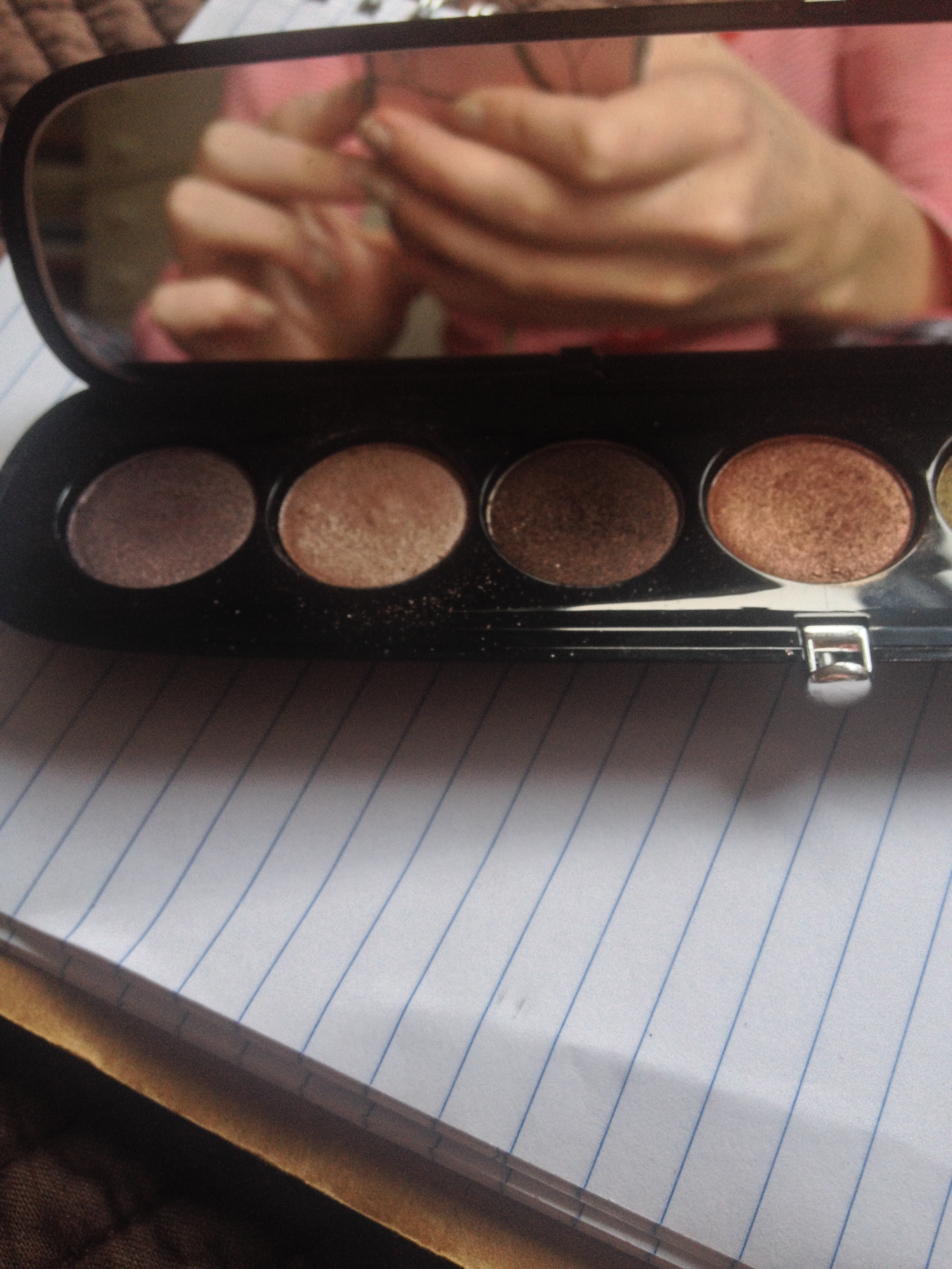
I seem to have this tendency to forget to talk about the basics so I’ll begin with such details. The sleek black rounded and compact contains five shades with 0.24 oz (0.035 oz each so slightly smaller than the average full-sized shades) of product and luxurious packaging featuring a moderately sized mirror and a secure clasp closure. At Sephora, the palette retails for $59 US/$71 CDN. In line with the description of the palette, all shades are metallic but I must say they are refined shimmery shadows, more in line with Dior’s shimmery shades than Urban Decay’s and I don’t have a particular problem with the lack of matte shades but this won’t necessarily be an all-in-all palette. However, I wear this alone but also like to use alongside my staple matte shadows.
The shadows are among the best that I’ve ever tried – very longlasting, pigmented, iridescent, smooth, buttery and blendable – and they are technically neutral shades but they are very interesting for neutral shades and differ from the average neutral palette. Overall, the palette seems to be warm-toned (although there are one or two cool shades) and if you’re a fan of the Naked 1, I see you really being wowed by this offering. For some semblance of clarity, I’ll talk about the shades from left to right in the palette.

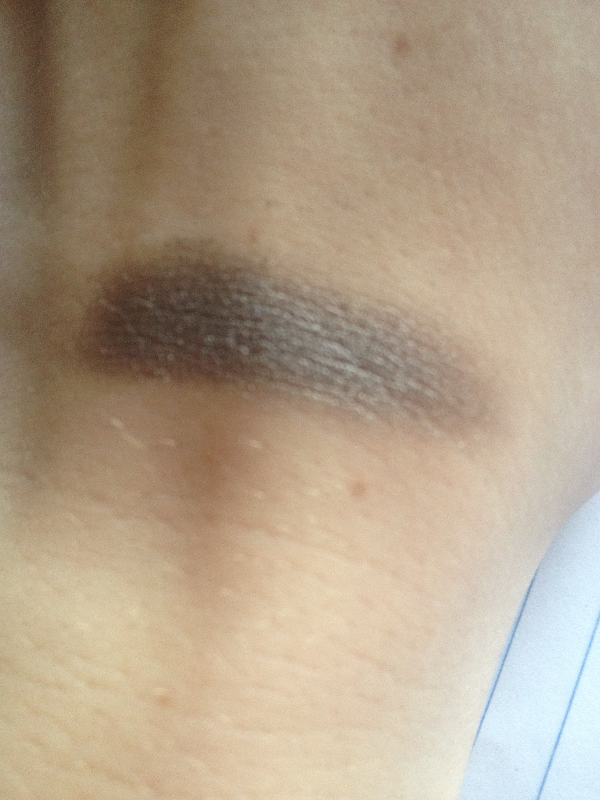
Shade One is a medium-toned purply taupe that reminds me of MAC Satin Taupe with more purple and lighter in colour and is similar but more purple-toned than the second shade in NARS Kalahari.
Shade Two is a peachy-pink champagne shade that has warm undertones, lighter than MAC All That Glitters but darker than Urban Decay Sin.
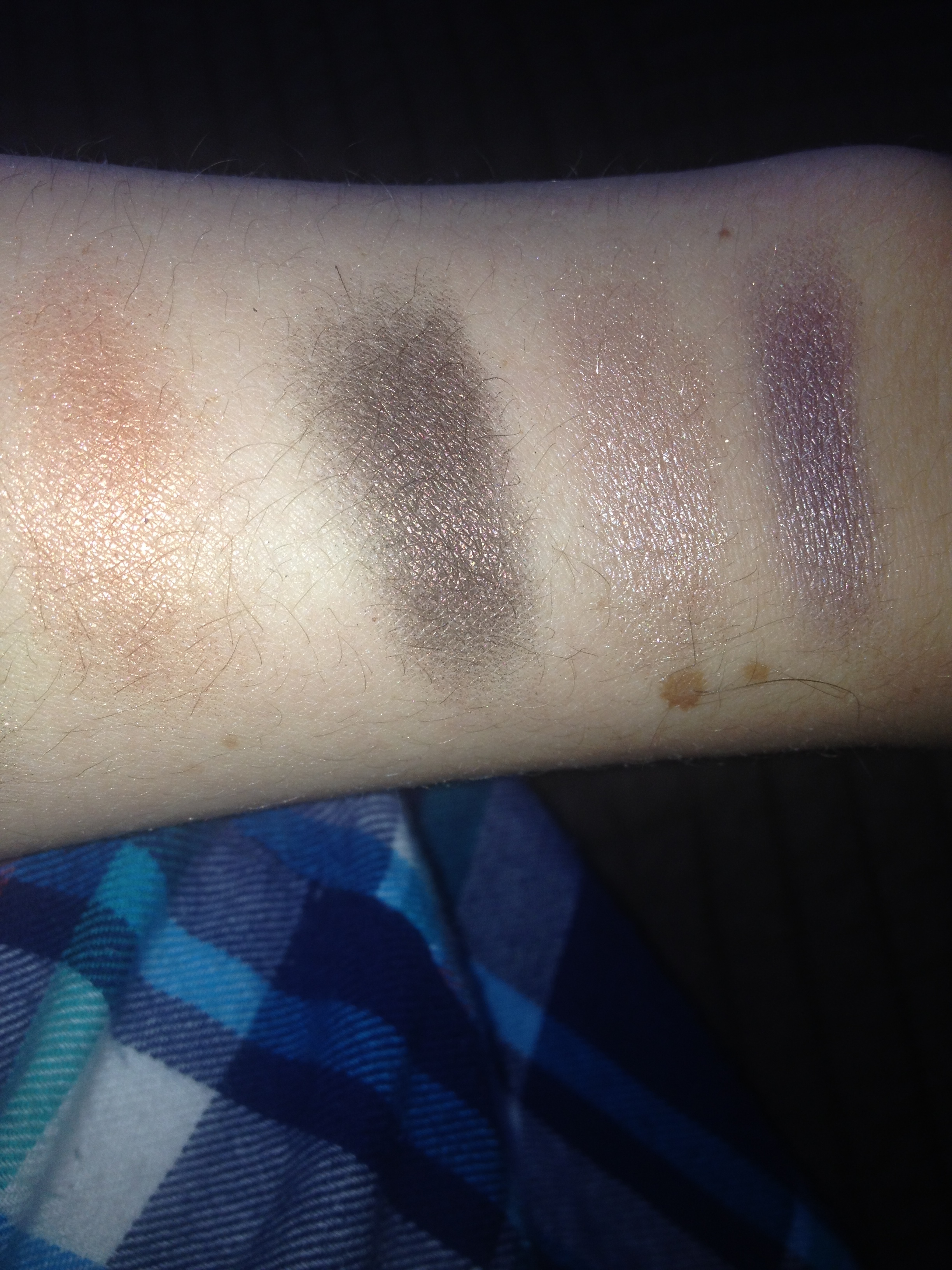
Shade Three is a warm bronzy darkened chocolate brown that is similar to Urban Decay Darkhorse but is less green-based and more bronze.
Shade Four is a light-medium true copper shade that I don’t own any shades that are similar to but I would describe this shade as being halfway between the uber-dramatic MAC Coppering and the more subdued MAC Woodwinked. It’s a wearable copper.
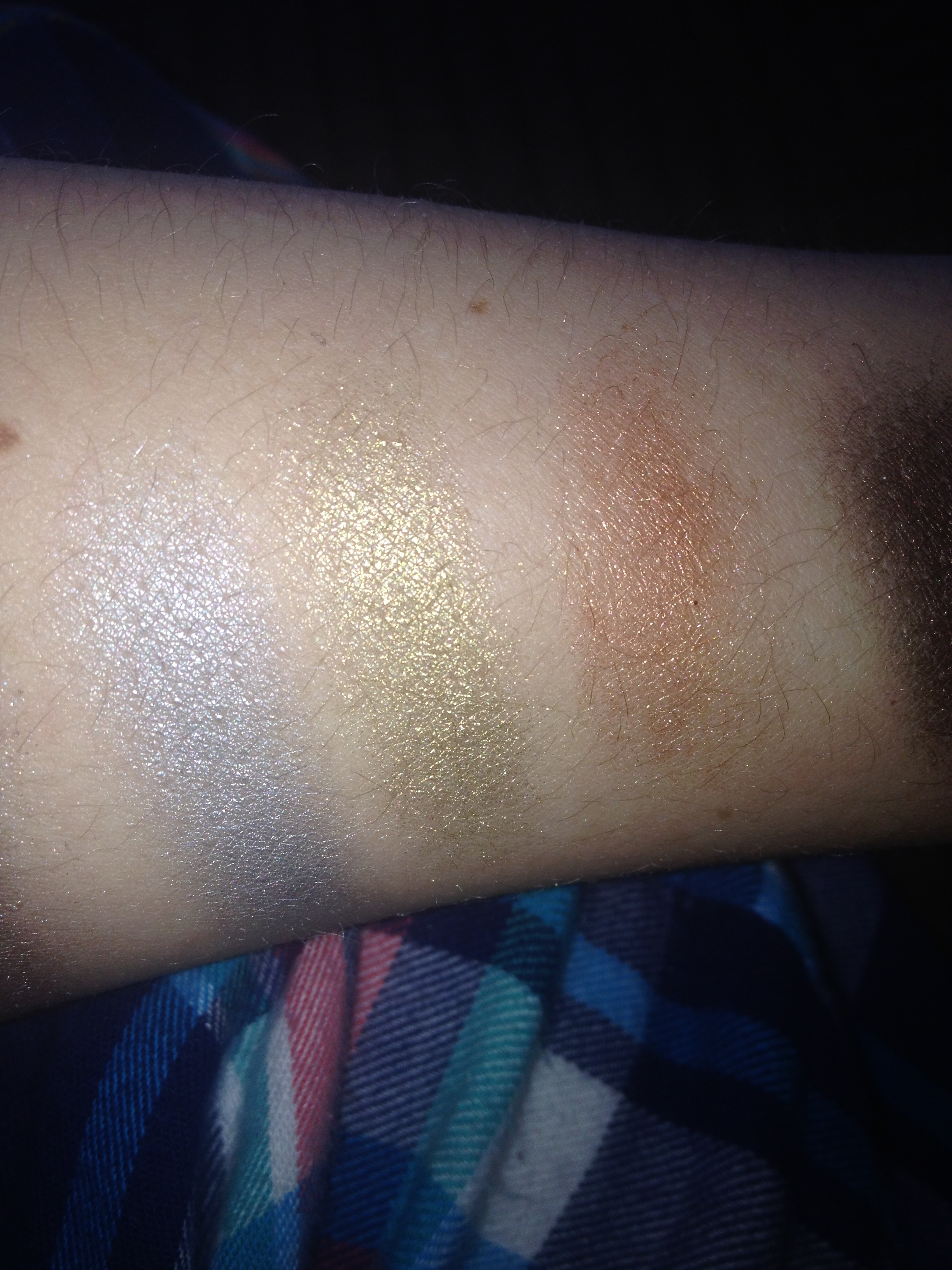
Shade Five is a relatively light silver with a noticable blue lean to it. It reminds me of the “eyelid” shade on the left hand side of Wet n Wild’s Blue Had Me At Hello.
Shade Six is a medium-toned antiqued gold that I don’t own anything similar to and is much less warm-toned than say Urban Decay Half-Baked.
Shade Seven is deceptive in the pan, as the shade pulls much more neutral and taupe in tone when applied onto the lids; it’s a medium-dark taupe-grey shade that to me looks like a darkened and greyed version of MAC Satin Taupe and reminds me of Urban Decay Mushroom.
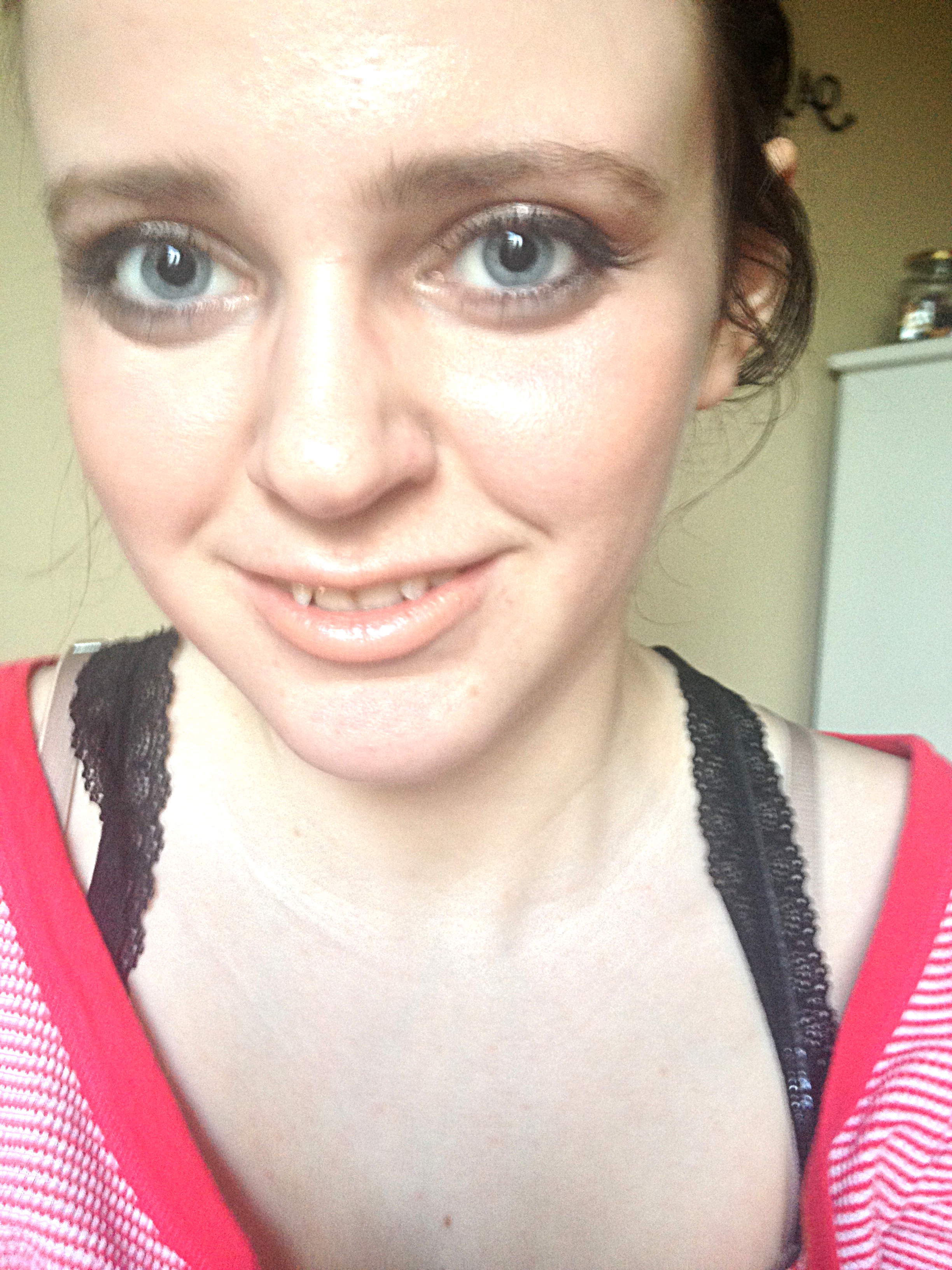
The shades are all consistent in quality and this is one of those palettes that I wear all the shades on a regular basis – the metallic palette is surprisingly versatile in my experience. The champagne is one of those lid shades that I adore and the copper is subtle enough to be worn with more dramatic lips while still looking striking. The purply taupe is lovely in the crease. The gold is a stunning one and it seems wearable because it’s an antiqued tone. The silver is beautiful for a smoky eye – I wore it on New Years! – but can be difficult to wear on the regular because of its blue lean. The grey-taupe seems to be the perfect shade to smoke out the eye without creating much mess or fallout and the dark bronze is dark enough to use to define the outer corner and lashes. I think the palette was rather well thought out but I would only recommend if you’re a fan of shimmery shadows. This is a palette that I find myself reaching for both when I want to wear a bolder lip and need to tone it down on the eyes and when I want to go for some smoulder.


The Rating Breakdown
Pigmentation – 10/10
Longevity – 9.5/10
Packaging – 10/10
Value – 9.5/10
Overall Quality – 10/10
Total Grade – 49/50= 98%/ A+
x,
Maggie.
Have you tried any products from Marc Jacobs Beauty? What do you think?

I’m really glad I discovered your blog while googling for dupes for the starlet palette. The shades looks so beautiful and Im jealous you own it!!!
I can definitely relate on the makeup jealousy note and it’s always heartening to know that people are actually enjoying my posts!