Unheard and Under-Appreciated #2: Fresh Sugar Lip Treatment in Cherry

IMG_5778

IMG_5770IMG_5773

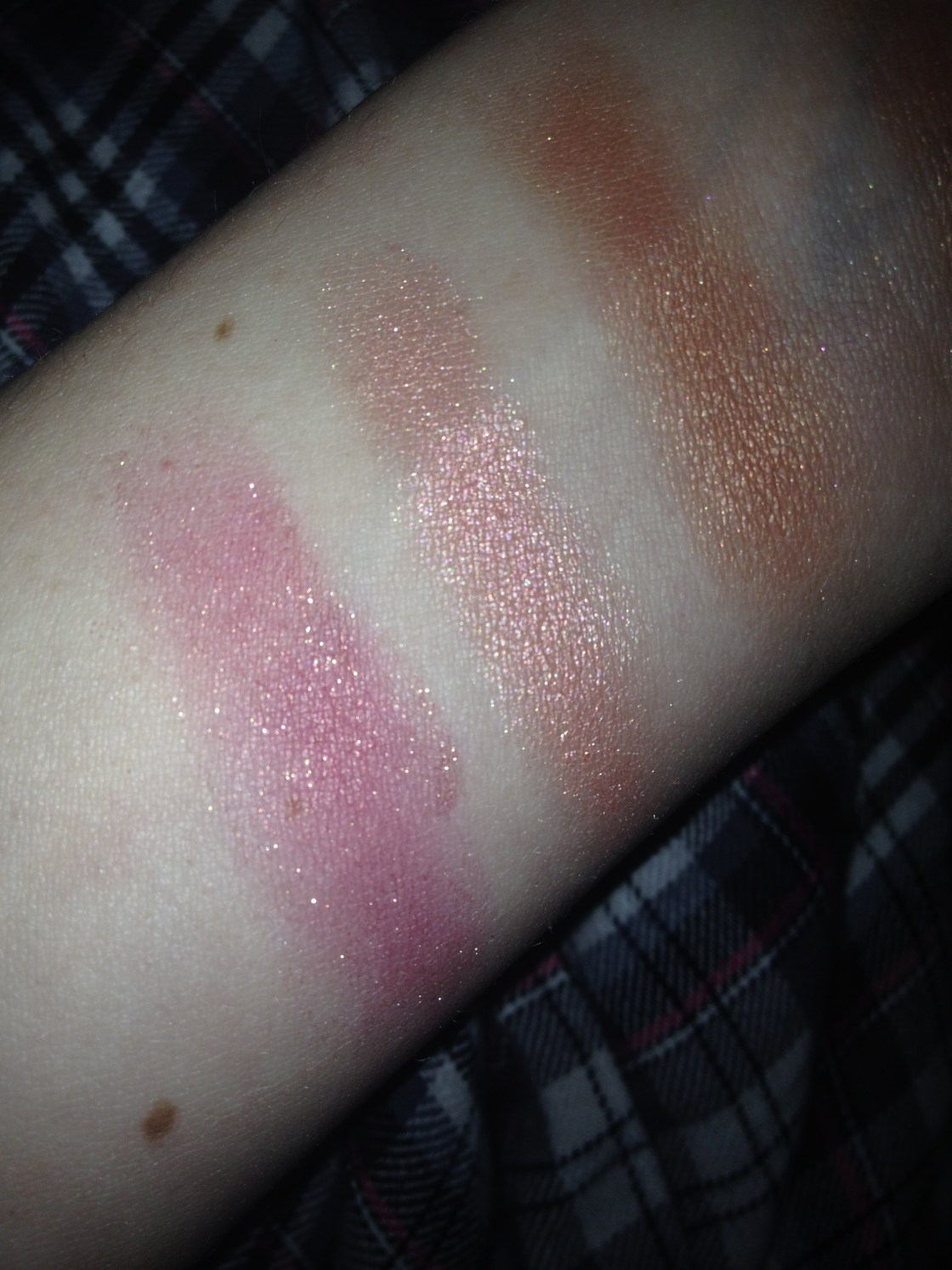
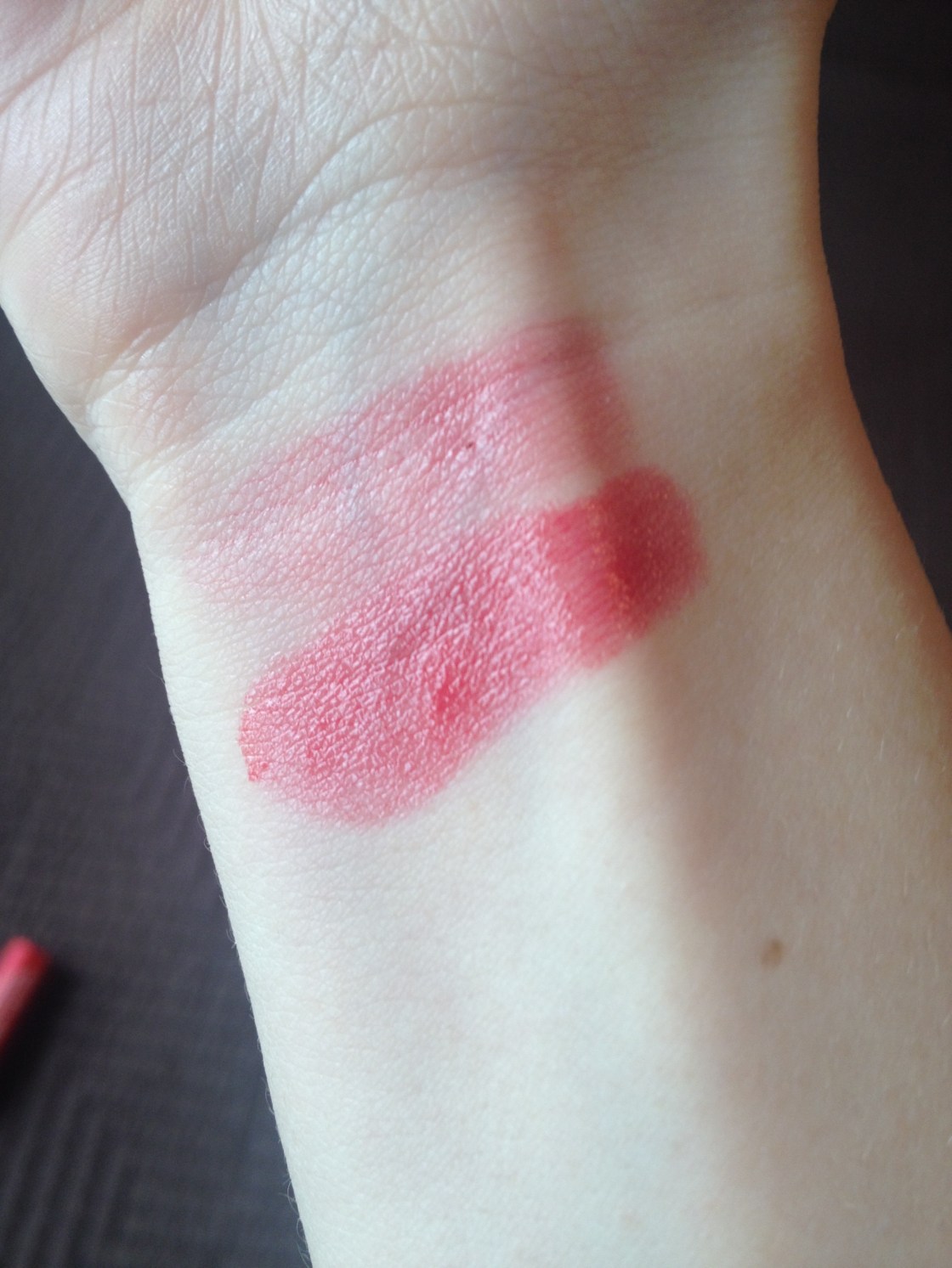
blended out vs. standard application


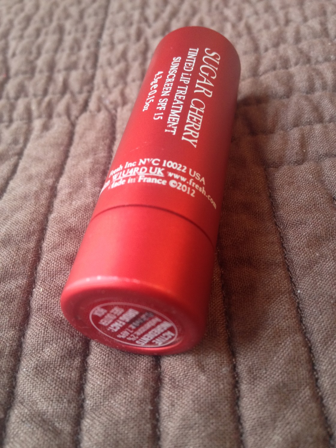
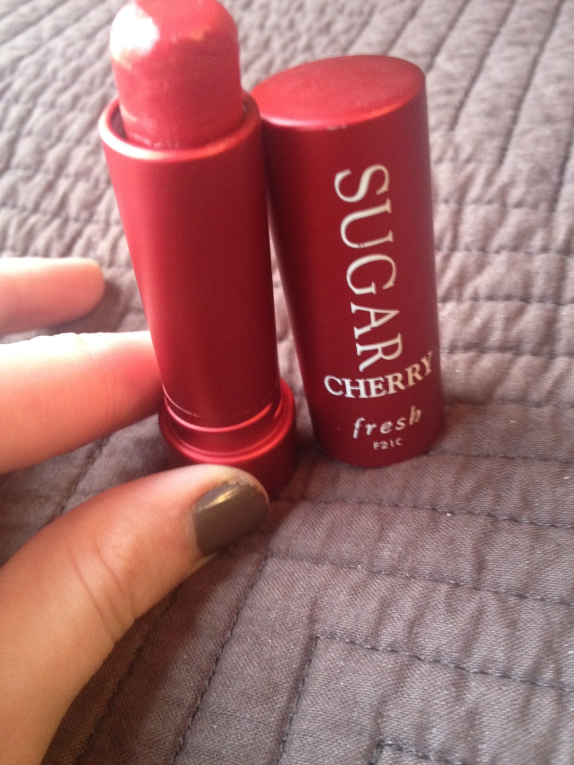
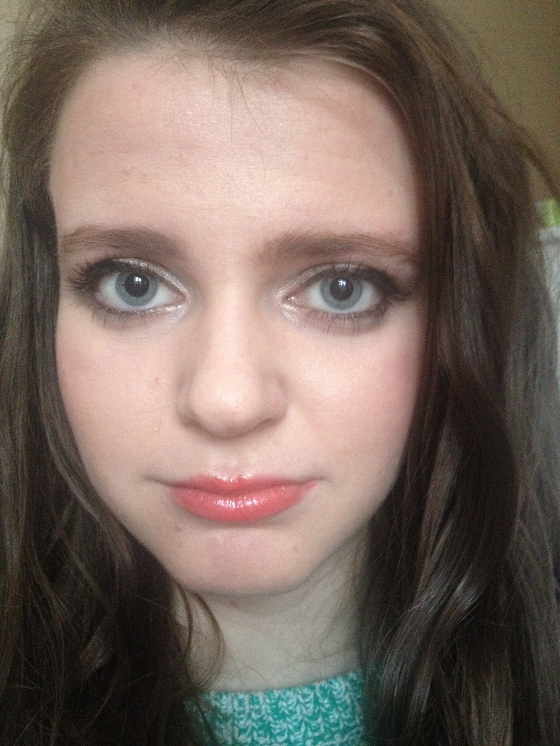
It completely astounds me that I don’t hear much about these Fresh Sugar Lip Treatments as the tinted balm kind of products keep on increasing and increasing in popularity and these have got to be the best formula if this shade is anything to go by. After enjoying the sample of the regular lip balm and enjoying it tremendously for actually helping to heal and hydrate my chapped lips, I asked for a tinted one for Christmas and surely enough this one appeared underneath my tree and although it may not be a product I rave about frequently it’s one of those rare lip products that also has significant skincare properties as well – it performs well as a balm regardless of it’s pigmentation but it does well on that front too unlike the rest that I’ve tried.

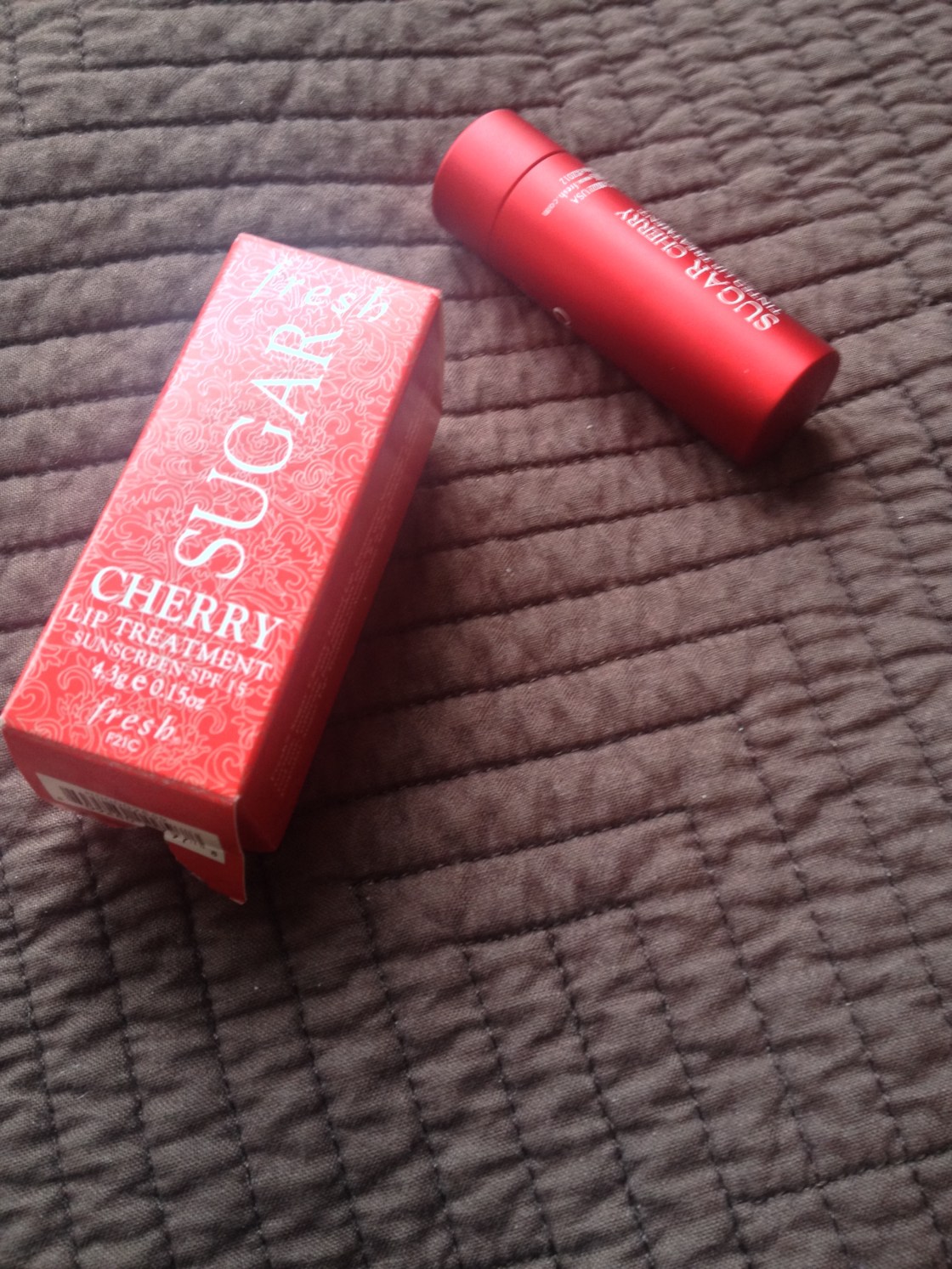
The Fresh Sugar Lip Treatment in Cherry retails for $26 CDN at Sephora, contains SPF 15 (with avobenzone and octinoxate) and 4.3 grams of product while promising to be a hydrating and nourishing lip balm while still providing a tint of colour. I’m one who tends to be a skeptic about products achieving their outlandish claims but I think this tinted balm does more than it even claims to do. It nourishes damaged and sore lips very well in the way that an effective balm only can while providing medium-buildable colour payoff that actually sticks around on the lips for 3-4 hours with some eating and drinking here and there without smearing or wearing off unevenly.

I’m someone who suffers from uncomfortably sore dryness on any sort of skin and in the winter here, I’m slapping on the lip balm like my life depends on it (and using the good stuff) and my lips are still sore and a bit chapped. The formulas that promise to provide moisture and colour that everyone and their cat raves about (Revlon Lip Butters anyone?) are just not cutting it, as my lips have gotten to that point where even these comfortable formulas are not sitting nicely and they need intense nourishment to soothe the less than ideal bits and without sacrificing the longevity and pigmentation, the Fresh Cherry Sugar Lip Treatment delivers. The balm feeling on the lips lasts for the full duration that the product remains on the lips and even when the product has faded, my lips are left feeling nourished which is extremely rare for me. They feel heavenly on the lips, just like a lip balm but without the waxy feeling of the lip butters etc.

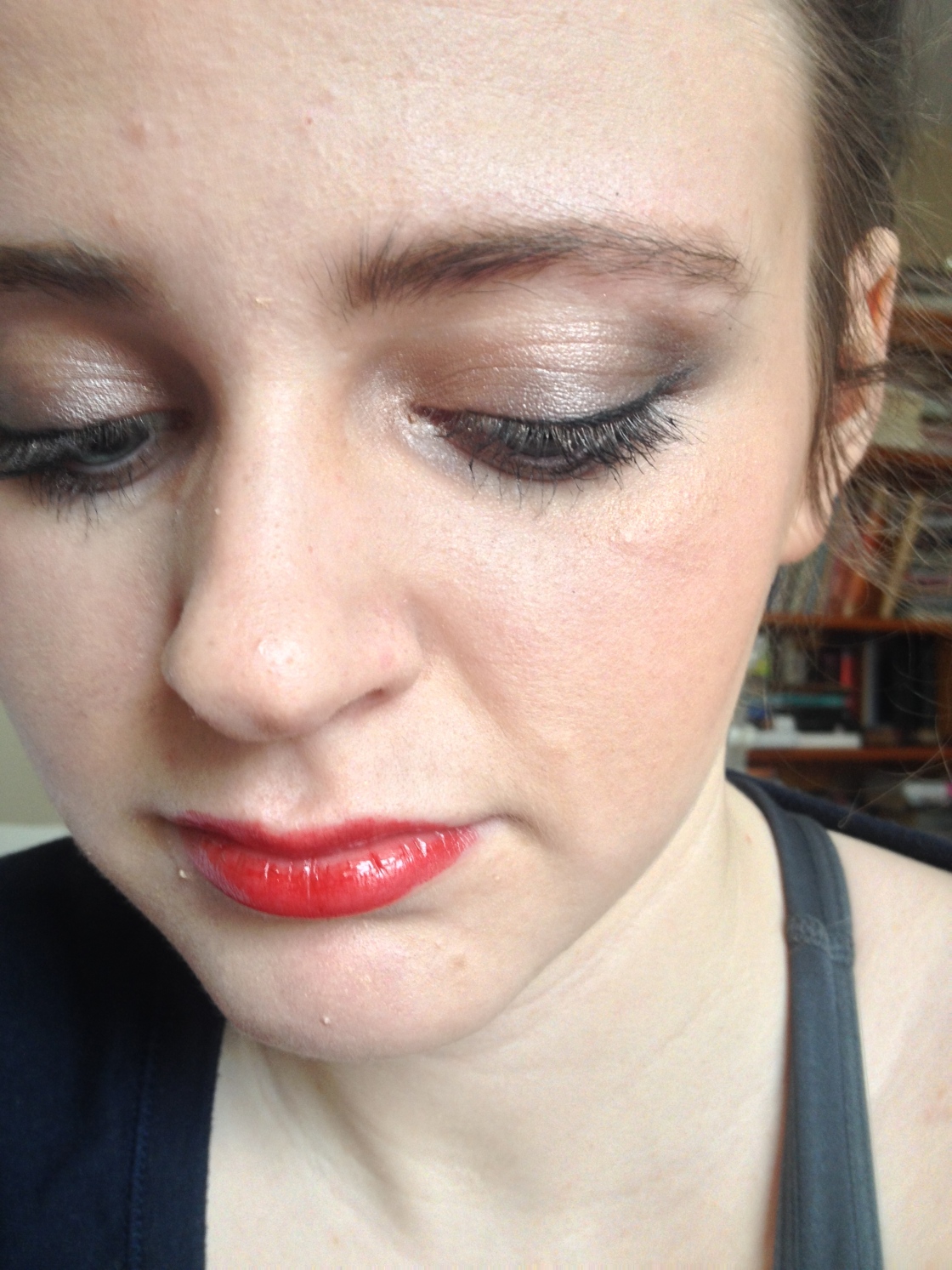
The Cherry shade is a fairly bright cherry-red (as the name would suggest) that seems to lean brick red on me with neutral-warm undertones. Although the treatment first applies somewhat sheerly, they quickly are built up to full on colour. This is everything that I had hoped that the Revlon Cherry Tart Lip Butter would be but wasn’t — much more saturated with pigment, without shimmer while being intensely more moisturizing and forgiving on sore lips. This seems like the perfect shade to wear to class as it provides the nice red tone that adds life to my face in the mornings, requiring no maintenance while still moisturizing the lips very effectively.

the Fresh on the top with a sheer layer, the Revlon on the bottom built-up

I’m afraid to say that this balm is worth the hefty price tag and I foresee myself picking up a few more shades in the foreseeable future. The only thing I can find to criticize in the product is the size of the bullet — as it does not taper to a tip, it can be difficult to apply due to its strong pigmentation – but I really can’t complain on any grounds.

IMG_5763

What are some of your favourite under-appreciated products?

Maggie, x.
Maybelline ‘The Buffs’ Lipsticks in Blushing Beige & Nude Lust

IMG_5669

IMG_5662

IMG_5668

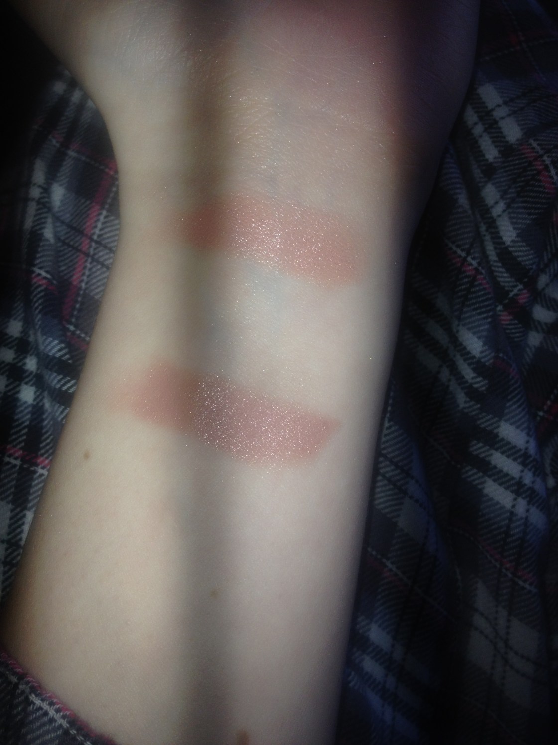
top: Blushing Beige bottom: Nude Lust
top: Blushing Beige
bottom: Nude Lust

“Spring Break” can be somewhat of a funny thing; when you think of said break, you most likely are thinking about partying down south and relaxing but in my reality, it’s going to be spent sleeping and trying to get some much-needed work out of the way. So this break (beginning today err yesterday now) does not actually feel like your average break (I’ve such a thing does exist) as it will involve a good quantity of labour but let me say that I’m delighted to have some time to breathe and laze around home in pyjamas with my hair in a messy bun, plopped unattractively on the top of my head. Step one is getting out some of these posts that I’ve been meaning to write for ages.

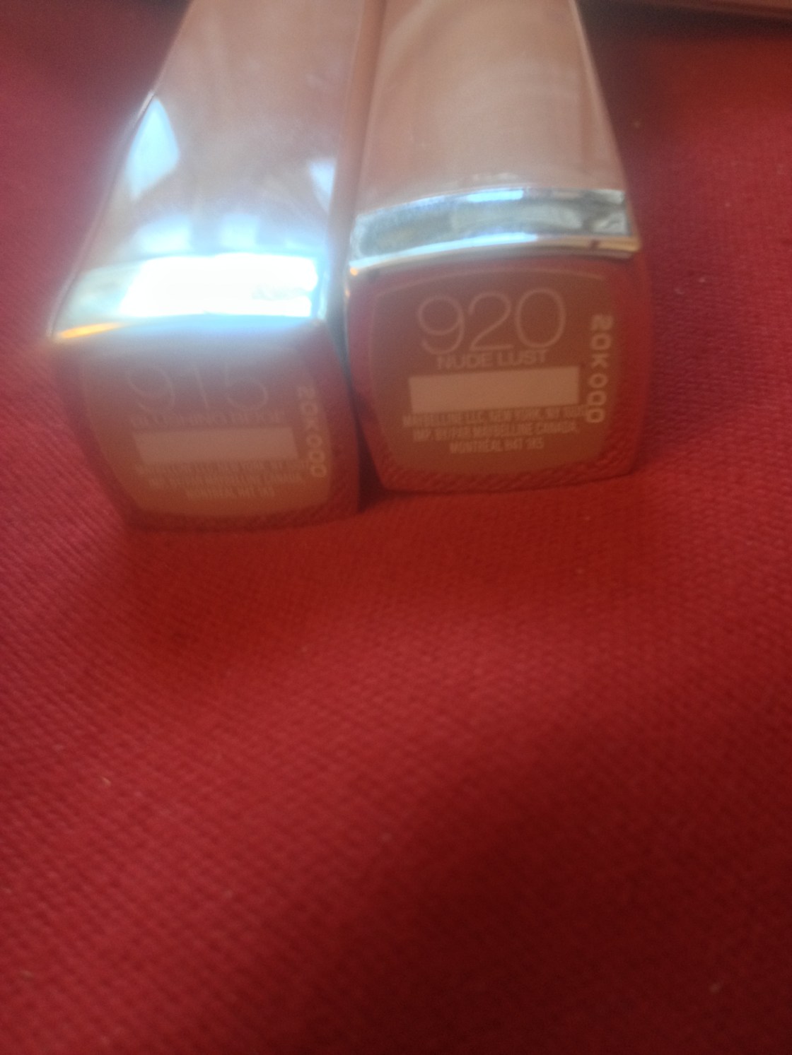
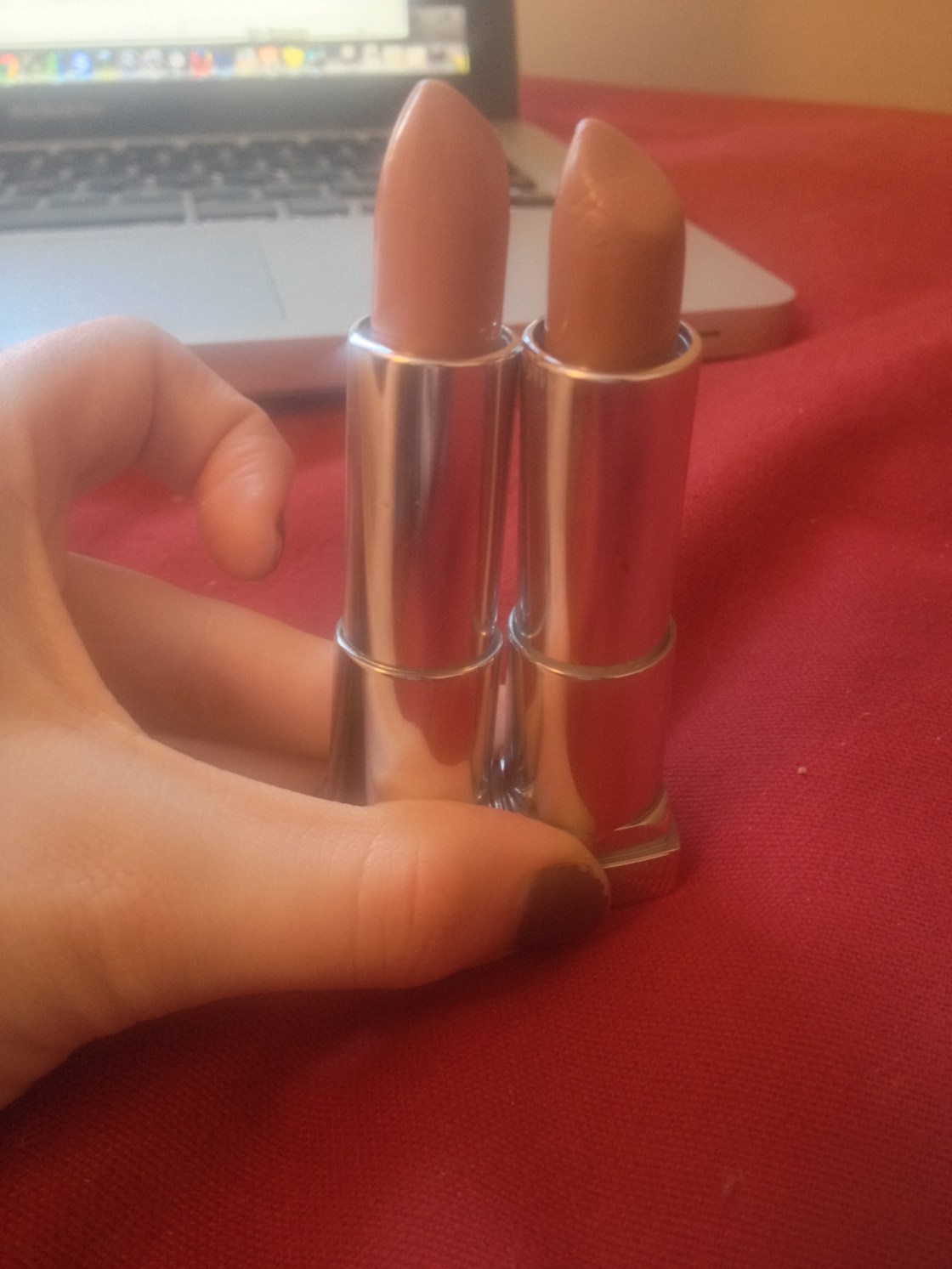
As always, it took ages for the Maybelline The Buffs Lipsticks Lipsticks to enter to the Canadian waters but when they did and went on sale while doing it, I was all over that display. The collection features numerous ‘nude’ lipsticks that would suit a variety of skin-tones ranging from the pale beiges to darker browns and I picked up two shades on the lighter end (but not the lightest) of the spectrum, 915 Blushing Beige and 920 Nude Lust. These are a part of the large colorsensational line and retail for $9-10 CDN and certainly less in the US. Blushing Beige applies (and swatches) paler than it appears in the tube so although the shades look similar in the tube, they are remarkably different on the lips. This shade is a warm-toned peachy nude that is on the lighter end of the spectrum but does not appear ghastly in the least. Nude Lust has a more neutral base and comes off as a medium-toned beigey nude with a wee bit of brown in it and none of that peachiness.

Both of the shades have that typical Maybelline play-doh smell that I may not particularly like but am not altogether bothered by. The entire Buffs collection comes in the unexpected packaging except the bullets are covered with a more opaque beige-brown lid that looks a great deal less cheap than the packaging of the much-loved Vivids line, if you ask me.

While the formula is not infallible, I was quite impressed with it overall. I’ve only tried these shades which are obviously both on the lighter end of the spectrum but I do find these shades highlight the dry patches in my lips ever-so-slightly – but I do have very dry lips which I do not actually in fact exfoliate… Both of these have a nice cream finish that last on the lips for 3-4 hours with slight eating and drinking which is impressive for how comfortable and lightweight they are to wear. I do not necessarily find them hydrating but I’m certain that they are not drying in the slightest and they are lightweight on the lips. The formula reminds me of MAC Cremesheen finish but to be honest I like these better (read: I don’t adore the cremesheen formula). They are fairly opaque but can be sheered out slightly.

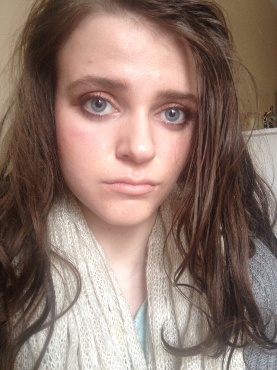
These two shades have found a home in my purchase along with my stash of lip products that seem to accumulate and I’ve been enjoying wearing these loads. I love both of the shades for different reasons and the only thing that would make it better is if they kind of had a shade that mixed the qualities of the two, being slightly darker like Nude Lust whilst still having the flattering pink-undertone of Blushing Beige. Blushing Beige, on me at least, seems to be shade that I reach for when I’m wearing heavier eye makeup as it is a bit too light to be worn with more minimal makeup on the eyes, whereas Nude Lust can be worn wearing lighter eye makeup as it isn’t so pale – I’m aware that I’m stating the obvious here but it had to be done.

915 Blushing Beige
915 Blushing Beige
920 Nude Lust
920 Nude Lust

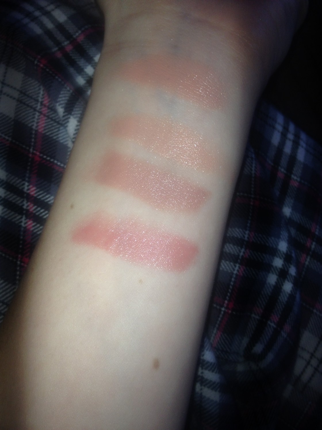
Barely Blushing is similar to MAC Creme d’Nude in both finish and colour, however it is slightly darker and has stronger peachy undertones. Nude Lust reminded me of MAC Patisserie but the Maybelline offering has much stronger beige undertones and the formula is much more opaque and less shimmery and glossy. Patisserie is very pink in comparison.

IMG_5658
Top-Bottom: Maybelline Barely Blushing, MAC Creme d’Nude, Maybelline Nude Lust, MAC Patisserie

Have you tried any of these? What are your thoughts?

Maggie, x.

Urban Decay Naked 3

IMG_5140

IMG_5529

IMG_5527

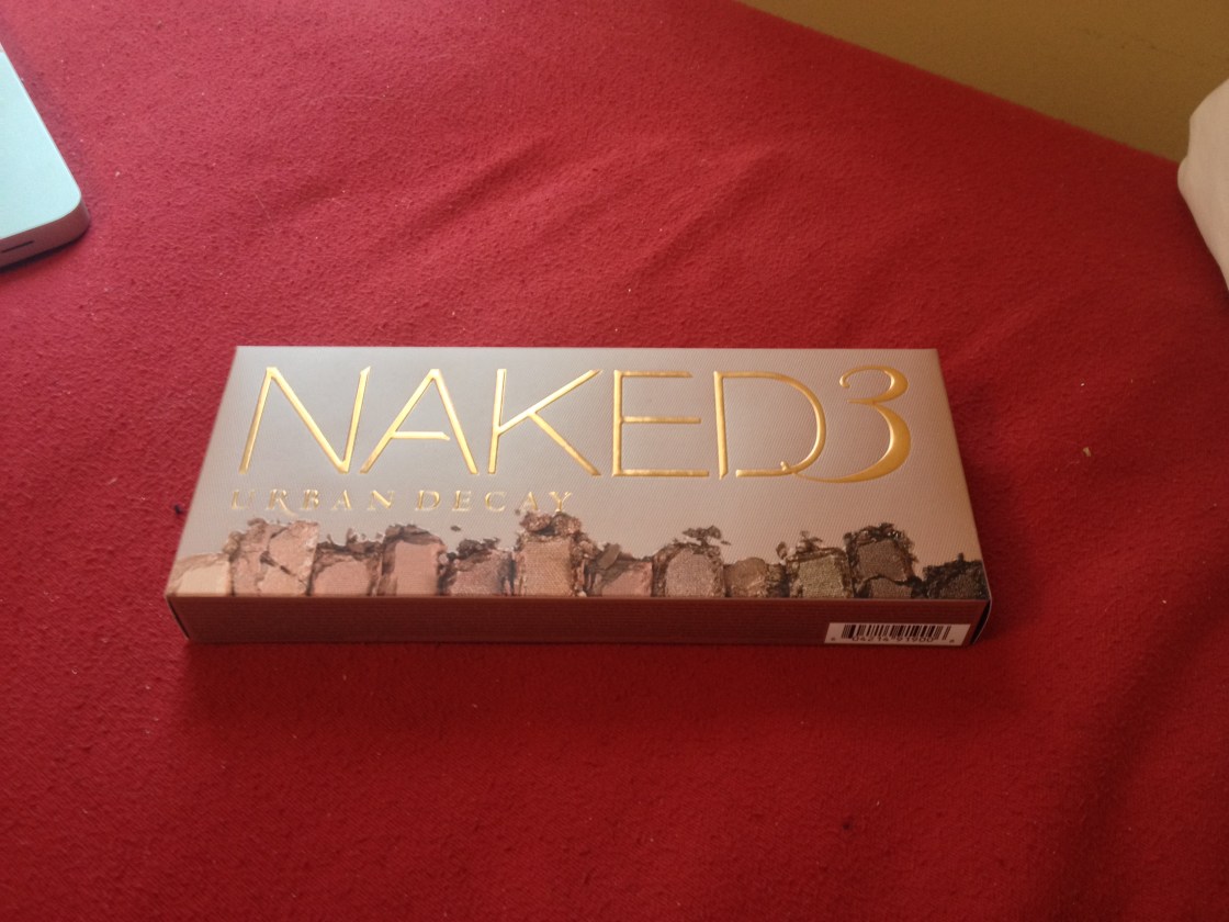
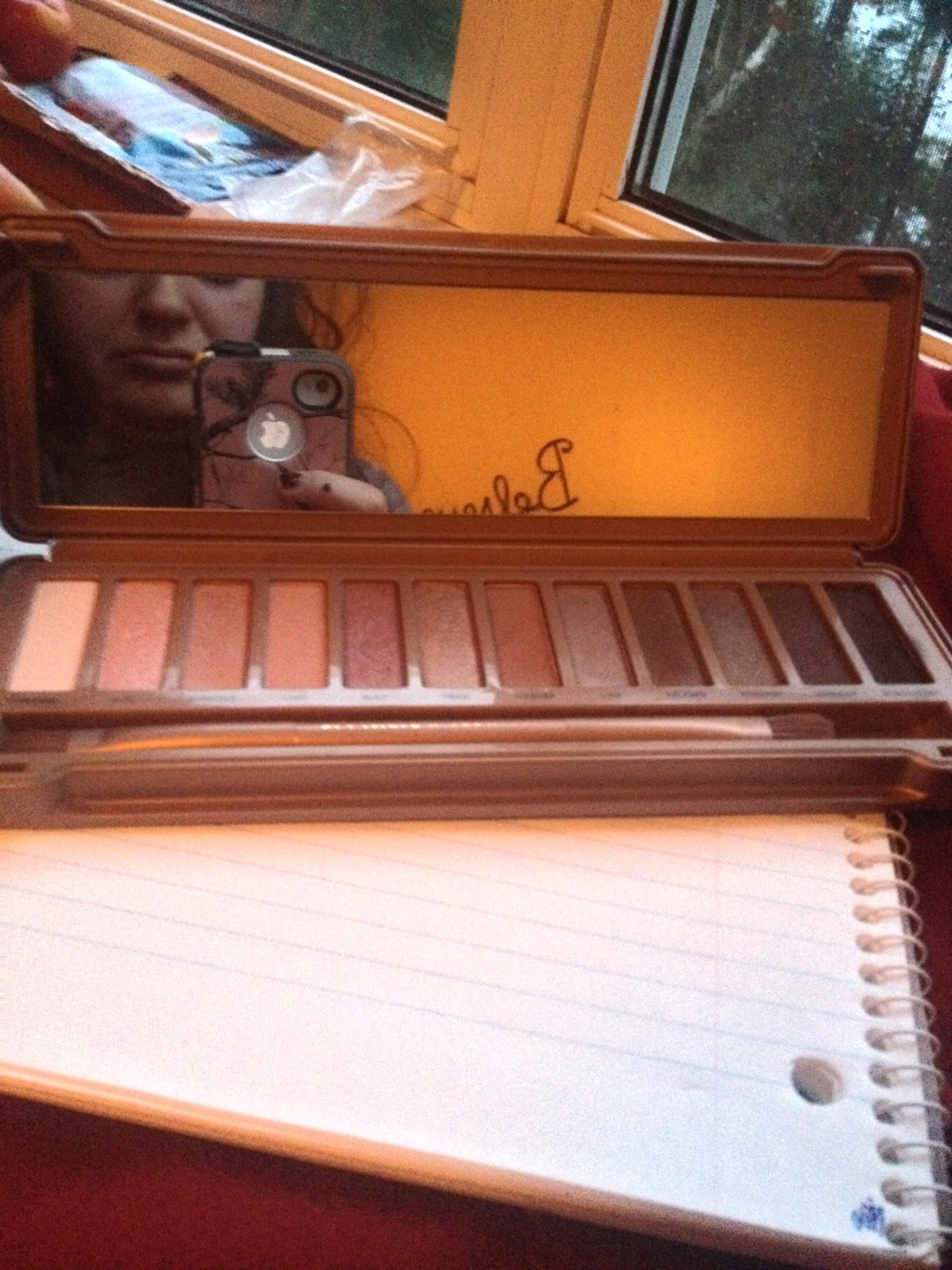
I’m very late on the bandwagon with this one as I forced myself to resist buying it until the very end of January and after using it exclusively for two weeks – I think I wore an eyeshadow from a different palette maybe once – it’s safe to say that I’m in love and I’m not one to declare my undying love for a palette unless it’s something magical. I’m not saying that the formula of these shadows are magical but they are really nice shadows that one expects from Urban Decay (but with some fallout as can be expected from shadows of this texture) combined together in a versatile and flattering way – for my skintone at least. When I saw the first photos on the palette when its existence was rumoured, I was not interested one bit because those icy pinks do not suit me and I’m not into that whole extremely girly look. I’ve said it before I use the Naked 1 constantly and I’ve been happy with it as it contains the flattering warm shades for my skintone but some essential lighter shades are missing from the palette in my opinion. Because Naked 3 was cool-toned, I didn’t think it would be a wise choice for me but I’m pleased to say it’s not as it seems. Naked 3 is a warm-toned palette, but unlike the first in the series, it has more colour options on the lighter end of the spectrum and the shades lean on the warm rosy side rather than the bronzes and as much as I like bronzes, these shades are some of my favourites.

The general tone of the palette follows shades like MAC All That Glitters, NARS Kalahari and Urban Decay Hustle and Sin. In my humble opinion, this palette would be great for two specific groups of people (a) those who suit warm-toned shades and (b) those who want to work with warmer toned shades but find bronze-based shades pull to orange-y on them. I know it’s premature to say this but I think that this might be my favourite palette of all time, pulling ahead of the original Naked Palette.

IMG_5538IMG_5539

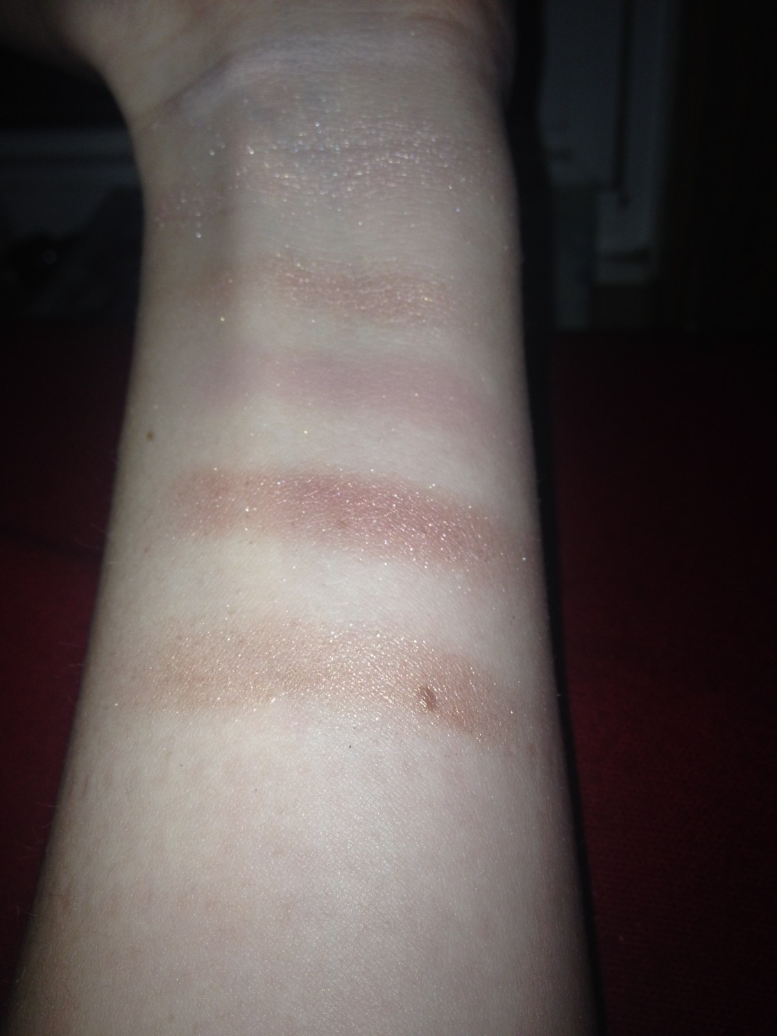
The shadows themselves are pigmented while still remaining easily blendable and smooth. The mattes are particularly impressive in formula here – I’m including Strange even though it’s listed as a satin here – and serve as flattering highlight, transition and crease shades on my moderately fair skin; the palette is versatile and great for travelling on account of the inclusion of these three staple shades. Strange is a pearly ivory shade with a rosy lean to it that is a highlighting shade, the transition shade is Limit, a light rosy-taupe and Nooner, the darker rosy brown, is my crease shade of course. A few of the lighter shades are prone to fallout but most of this can be prevented by being careful; the only shade I dislike working with is Dust, the pinky champagne shade as it is verging on glittery with fallout issues and doesn’t impart a great deal of colour onto the lid – nevertheless as it’s a light shade it is workable. Trick (coppery rose-gold) and Buzz (warm rosy-shade that is perhaps the pinkest but has some mauve-taupe in there for sure) can be prone to some fallout (but this can be remedied by applying it with the fingers onto the lid or tapping the excess off of the brush) but their texture and pigmentation is still great nevertheless – these have to be some of my favourite shades in the palette. And they don’t transfer onto the lid as glittery as they appear, I’m pleased to report. I can’t actually detect any of the microglitter like I could with Sidecar. The mid-toned shades seem to contain a refined shimmer and translate smoothly onto the lids; these include the more muted rosy-taupe shade, Liar, the darker taupe with mauve undertones called Factory and the more medium-toned mauve-taupe shade with some grey in it called Mugshot. The final two shades in the palette, Darkside and Blackheart, are the two truly deep shades in the palette that can be used (and I do frequently) to add definition and smokiness to the eye and they are both fantastic shades. Darkside was one of the shades that I didn’t expect much of and was flabbergasted when it blew me away – it’s a warm dark blendable grey with rosy-plum undertones and a satin finish. I’m also quite a fan of Blackheart, the palette’s “black” shade that is pigmented and workable without being chalky with gorgeous pink shimmer/glitter running throughout.

 Each of the shadows is full-sized (all twelve containing 0.05 oz of product each) and comes housed in the durable packaging that has a secure closure and a large mirror. It comes in a metal tin with copper swirled lettering over the rose-gold packaging. It came with the individual primer samples which didn’t really impress me but I can’t complain and I was quite a fan of the brush. The brush was a double-ended synthetic one, featuring a more precise paddle brush that is great for precise placement and a larger fluffier brush that works well for blending. I much prefer this brush to the one they brought out with the original palette. And of course it’s $52 US/$62 CDN. It’s worth that sum if you ask me and believe it or not I can be quite cheap.

IMG_5521_fotor

IMG_5175

IMG_5192_fotorIMG_5298

Have you picked the palette up? What are your thoughts?

Maggie, x.

The Monthly Roundup #2: January 2014

IMG_5017_fotorfive_fotor

Blogging-wise I’m pleased to say that I’m rather happy with myself this month. I managed to have twenty entries this month and although that’s not daily or anything, it’s pretty damn good in my book. I aim to keep it up. And I’ve been pretty happy with my content this month so here it goes.

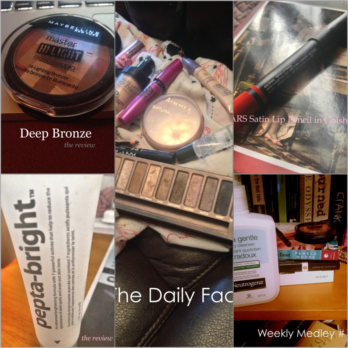
1. Maybelline Hi-lighting Bronzer in Deep Bronze

I’ve talked about this product (and the post itself) on a variety of occasions this month so this shouldn’t be much of a surprise but I fell in love with the product this month and somehow managed to put up a detailed review fairly soon after its release. I’ll shut up now.

2. Indeed Labs Pepta-Bright

This was one of those posts that I had been meaning to do for ages but never quite got around to until recently and I was pleased with the result. It’s a hero skincare product of mine in short and it’s bloody fantastic and the review is much more detailed obviously…

3.  The Daily Face #6: Warm and Smoky

After going through one of those blah phases when I wasn’t happy with my makeup for about a week straight, this is what pulled me out. It’s one of those makeup “looks” – I’m beyond hesitant to call it that — that was flattering and warm using the beloved Naked Palette, looking smoky but not over the top. Easily my favourite daily makeup of my month, hands down.

4. NARS Golshan Satin Lip Pencil

This post served as another piece of evidence of my mission to post actual product reviews frequently here and the product itself is divine and the shade does not get the recognition it deserves, if you ask me. It’s a gorgeous warm-toned wearable deep berry lip that does not dry out the lips or wear off weirdly.

5. Weekly Medley #1

This is a recent post and the first in a new series of mine that I have committed myself to and I was pleased how the chatty post turned out. You’ll have to let me know your thoughts. I rather enjoyed the mixture of lifestyle and casual beauty check-in post and I’m determined to continue with the series.

What were your favourite posts this week?

Maggie, x.
 

MAC Recommendations #1: The Basics

IMG_4987

IMG_4976

I don’t think that MAC is by any means the be all and end all of makeup but they are among my favourite brands and they were the company that kindled my makeup love and I might have slightly sentimental feelings toward the cosmetic store. Somehow I haven’t talked about the brand very much considering how often I use the products on a daily basis. From forcing my friends who are not beauty-obsessed into conversations about MAC and later-on trips, I know that many find the store extremely intimidating (moreso than any other high-end brand) and I can understand that but there are some real treasures there and quite often their products are very economical – not that much more expensive than drugstore and at a fraction of the price of Sephora brands without sacrificing quality whatsoever. I don’t have a massive collection of MAC makeup but MAC is easily the brand that I own the most makeup of and I thought I’d attempt to challenge myself into giving my five ten recommendations: here goes…

IMG_4982

1. MAC Powder Blush in Harmony ($21/25 CDN)

If this isn’t the first post you’ve read of mine I’m confident that this hardly needs any explanation. It’s considered to be a blush by MAC (and it might be nice as one on dark skin) but it’s the ideal contour for fair and medium skin. It’s slightly warm toned but the rosy brown does not have any of the oranginess of a bronzer so it’s able to add shape and definition to the face looking natural while still adding some flattering warmth to the face. If you are darker than medium in colouring or find this difficult to show up, I know Blunt is equally as nice and if you’re lighter it should suit you. I do know that those with cooler-toned skin that’s as fair or even fairer than mine can find Harmony slightly red-toned and I’ve heard that Prism and Cubic are good alternatives. These are all matte obviously. Coincidentally these are all fabulous matte shades to use in the crease as well, even though they’re not marketed as eye shadow.

top: Dazzlelight, Vex, All That Glitters bottom: Coquette, Charcoal Brown, Satin Taupe
top: Dazzlelight, Vex, All That Glitters
bottom: Coquette, Charcoal Brown, Satin Taupe

2. MAC Eyeshadow in Coquette ($12/18 CDN)

I have naturally unruly and large but sparse brows and there’s nothing like a matte eyeshadow that fills them in in a natural manner. I used MAC Charcoal Brown for ages which I still do really like but recently I discovered Coquette which is slightly cooler toned and looks like a gross khaki grey in the pan but fills in the brows without looking red, giving a natural appearance to them. The formula is great in these shadows (Coquette is technically a satin but it’s matte on) and they also are great for adding depth in the crease. I would reccomend Charcoal Brown for warmer brunettes, Omega for blondes and I’ve heard Brun is great for darker brunettes. This shadow is that workhorse product that may not seem super-exciting but is functional and worth the money. 

3. MAC Eyeshadow in All That Glitters ($12/18 CDN)

This veluxe pearl eyeshadow is buttery, easy to work with and pigmented and is that perfect everyday lid shade that is neither too light or too dark – a shimmery but not glittery golden-peach shade that can’t be duplicated. I’ve been through two of these in the past and went without it for ages and now that I’ve picked it up it’s what was missing from my life. It’s a fairly universal shade but the cooler-toned fair skinned might find it to be slightly too coppery and I’ve heard that they favour the lighter pink-champagne Naked Lunch and on darker skin, Woodwinked can be a better option.

shown in Light
shown in Light

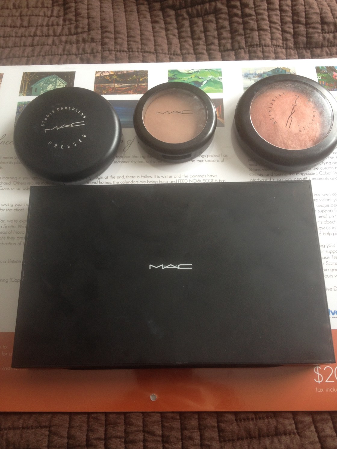
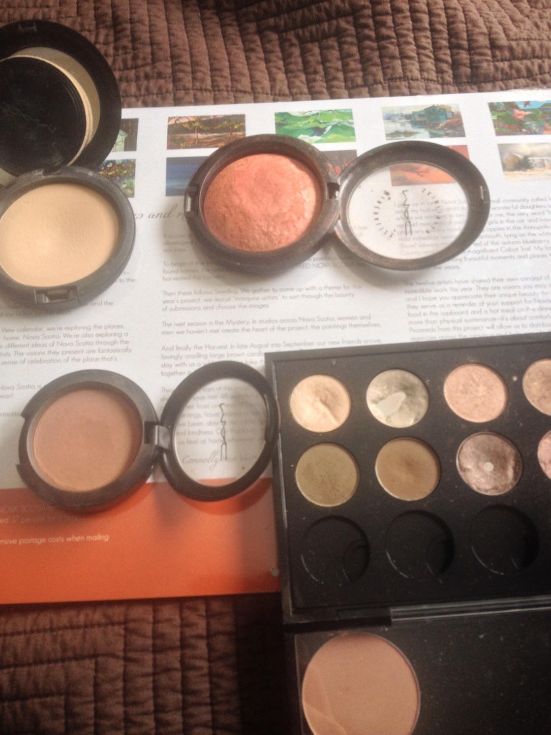
4. MAC Studio Careblend Pressed Powder ($32 CDN)

This might be a shocking product inclusion as I’m not a powder kind of girl but I’ve rekindled my love for this and this is easily my favourite powder of all time. It doesn’t have much coverage to it but it has enough to even out the skin when worn alone and sets the skin without looking matte and losing all of it’s glow. It gets rid of excess shine without being completely matte and its finely milled-texture sits nicely on the skin without clinging to dry patches. Anyone on the drier side of things would enjoy this but I know that those needing more oil control adore MAC Studio Fix Powder, which has more coverage to it and might not look quite as seamless but it’s a great powder nevertheless. I wear the lightest shade in the powder but Studio Fix has a much wider shade selection.

IMG_4986

5. MAC Mineralize Skinfinish in Stereo Rose ($35 CDN)

If you’re looking for a glow to your cheeks and particularly if you’re looking for a gorgeous highlight, these cult favourite products that tend to be released as limited edition items in the abundant collections are an offering to consider. I know that some can complain about the frostier shades of these can highlight larger pores for some but that can be remedied with a pore smoothing primer, or powder but I don’t have this issue and I didn’t even when I had more of a true combination skin years ago. I adore the infamous Stereo Rose that is limited edition but will be appearing as a repromote in the upcoming spring collection and I recommend it if this sounds good to you. This is one of the darker offerings, acting as more of a highlight-blush duo in one product – it has nice pigmentation, fabulous texture and has that sheen without being frosty. It’s a coppery pink-coral, I’d say. For lighter skin-tones it works as a highlighting blush of sorts and I know it works for darker ladies as well as a highlighter. On my warm-leaning skin this is an instantly brightening shade that is perfect when you only have a few minutes to slap on some makeup before heading out the door. I haven’t tried them personally but there are also some permanent options that I’ve heard so much about – Soft and Gentle is supposed to be a great champagne-peach shade that is a versatile highlighter.

Have you tried any of the products here? I would also love to have any recommendations!

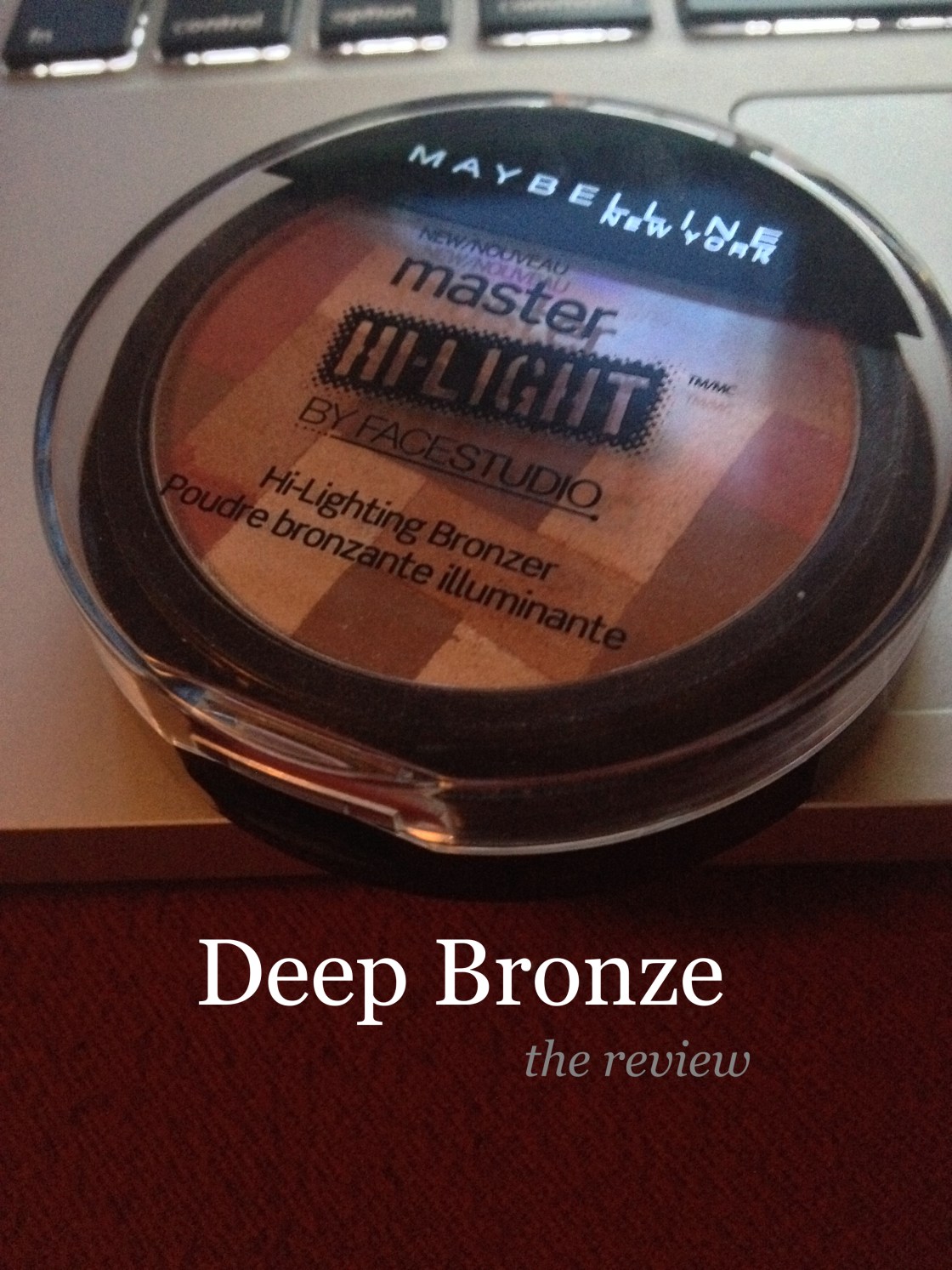
Maybelline Master Hi-Light By FaceStudio Hi-Lighting Bronzer in 60 Deep Bronze

IMG_4923_fotor

IMG_4929

Generally drugstore blushes do not entice me in my frequent sweep of the cosmetics aisle as they’re one of the few products that I don’t have a drugstore favourite of. Even the hyped Milani blushes do not compare to my MAC, NARS and Benefit favourites. I’m pleased to admit that I found a radiance boosting cheek product in those very aisles that does impress me, and this is it.

These mosaic blushes and bronzers come with a great deal of product (0.31 oz) and feature a good-sized mirror and a questionably flimsy blush in the compartment beneath the product itself. Both in Canada and the US, this product is fairly expensive for a drugstore offering; it seems to retail for $7-10 US and $12-16 CDN depending on where you pick them up. There are six shades in all (four blushes and two bronzers) and I picked up the darkest shade of the latter offering, Deep Bronze.

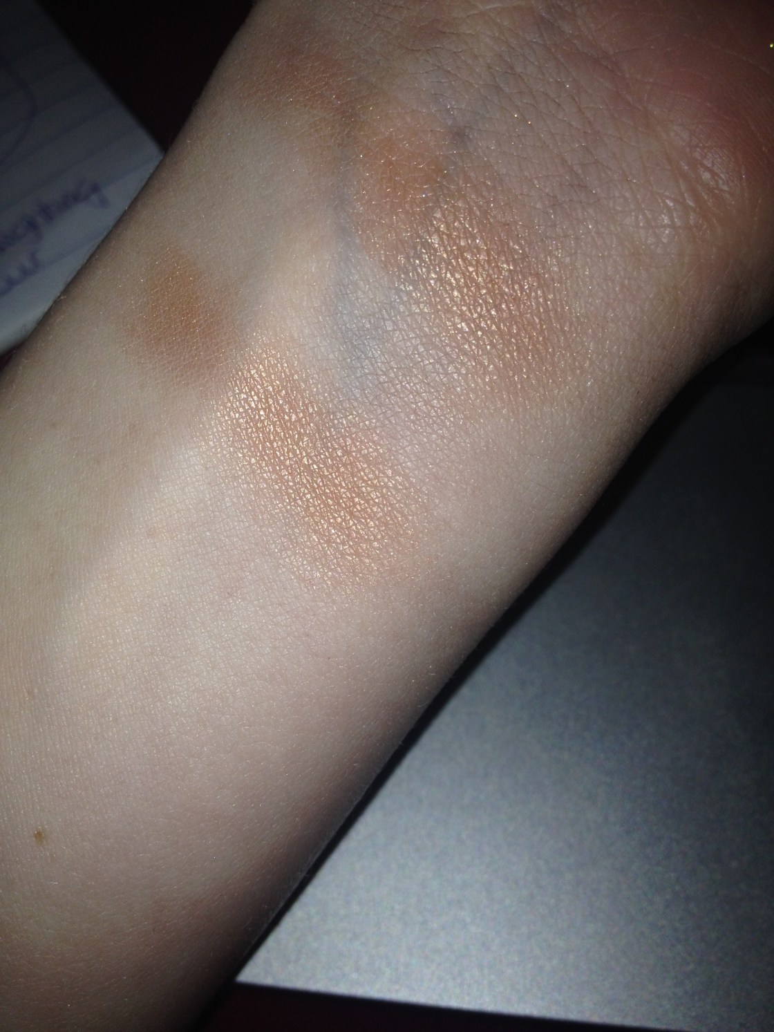
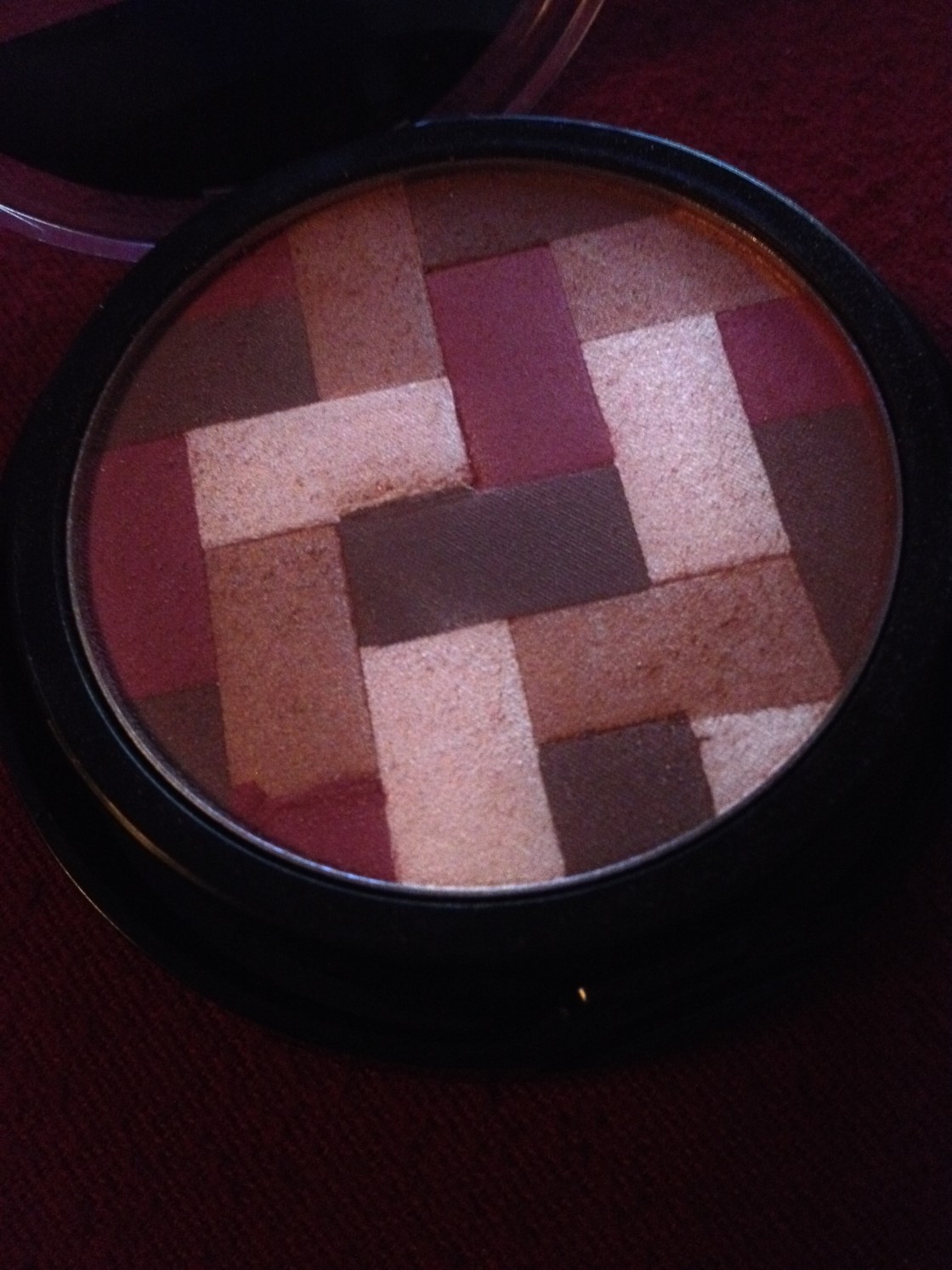
The mosaic design of Deep Bronze features a matte chocolate brown, a shimmery bronze, a satiny rosy burgundy and a golden champagne in sections that allow you to to control the colour by concentrating the product you pick up from certain areas of the product. In short, the general colour I seem to get is a luminous copper-leaning warm rosy bronze. I use this as a blush but it’s just as easily a shimmery bronzer. I also use a smaller brush focusing on the lighter colours and am able to get a nice highlight out of the product as well and this shade is remarkably different than the blended shade. I find this to be incredibly versatile – can you tell I’ve fallen in love?

light vs heavy swatch
comparison to MAC Stereo Rose (center) and Milani Red Vino (left)


The formulation of the blush-bronzer-hybrid struck me as remarkable upon my first use and my opinion hasn’t changed in the least since then. It’s pigmented, finely-milled and luminous, transferring as a sheen more than a shimmer or frost. While still being quite blendable and versatile in the colour intensity, Deep Bronze has better-than-good longevity. This strikes me as a less frosty version of a MAC Mineralize Skinfinish with slightly better longevity and pigmentation in a traditional powder form at a fraction of the price.

Maybelline markets the highlighting bronzer with the tagline, “our multi-tonal bronzer palette highlights skin and softly contours cheeks for an instantly defined glow” and now that I’ve been using this product for weeks, I can say that I agree with reservations – the highlighting is a given but the contouring is so difficult to achieve due to the size of the different blocks of colour and mosaic products like these get muddled after a few uses, making it difficult to pick up any product without shimmer. Nevertheless, this is a fantastic product. On my dry skin, the product wore for 9-10 hours without fading which is similar to my favourite high-end blushes. Summary: colour me impressed.

If like me, you want your cheeks to look luminous but not artificial, these seem to be the happy medium. This could suit fair to quite deep skintones by the virtue of the pigmentation although it might be difficult to pull of on those on the fairer end of the spectrum with cool undertones. I’m warm-toned for reference.

the blush/bronzer worn sheerly using a stippling brush
worn more full on (but can be built up much more than this!)

Overview

Pigmentation: 10/10

Texture: 9.5/10

Longevity: 9/10

Packaging: 8/10

Overall Value:  9.5/10

Total: 46/50= 92% or A+

Have you tried these?

Maggie, x.
Indeed Labs Peptabright (spoiler: in a world of lacklustre products, it’s brilliant)

IMG_3884_fotor

IMG_4899

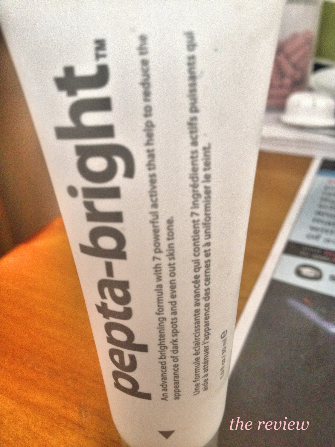
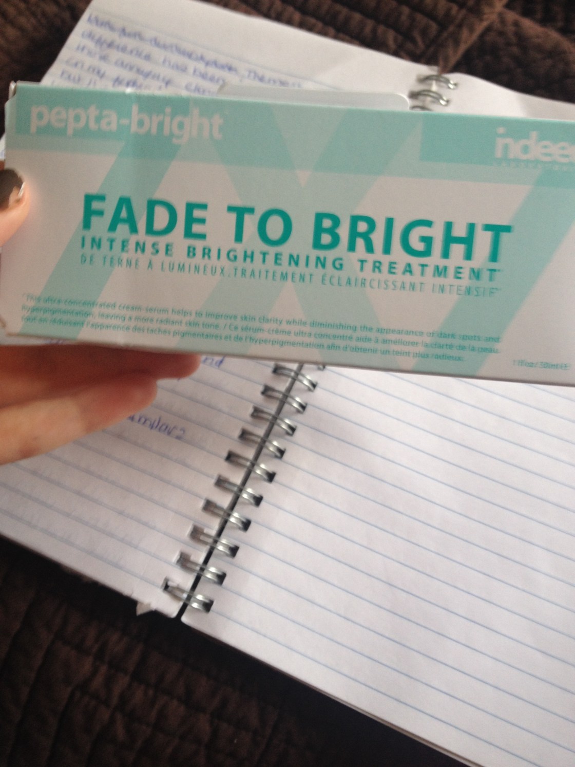
Skincare products can be difficult to judge as they’re not something that you’re measuring the results of for merely the time the product is sitting on your skin. I’m aware I’m not having my most articulate moment here but I refuse to give up on this post that is long enough overdue as it is. Retry time. Skincare is difficult to review fairly because its effects are more difficult to judge because they tend to be long-term, rather than merely covering-up the skin they aim to improve the skin itself and said difficulty is why I don’t write many skincare reviews but I feel confident enough to provide my verdict on the Indeeds Labs Pepta-Bright, as I’ve been using it since October and have seen results without making any other significant changes to my skincare regime. The serum retails for $40 CDN (at Shoppers), 25 GBP (at Boots) and can be picked up in the states as well in Walgreens. Long-story-short this is a brightening cream serum containing 30 mLs of product in a compact white tube.
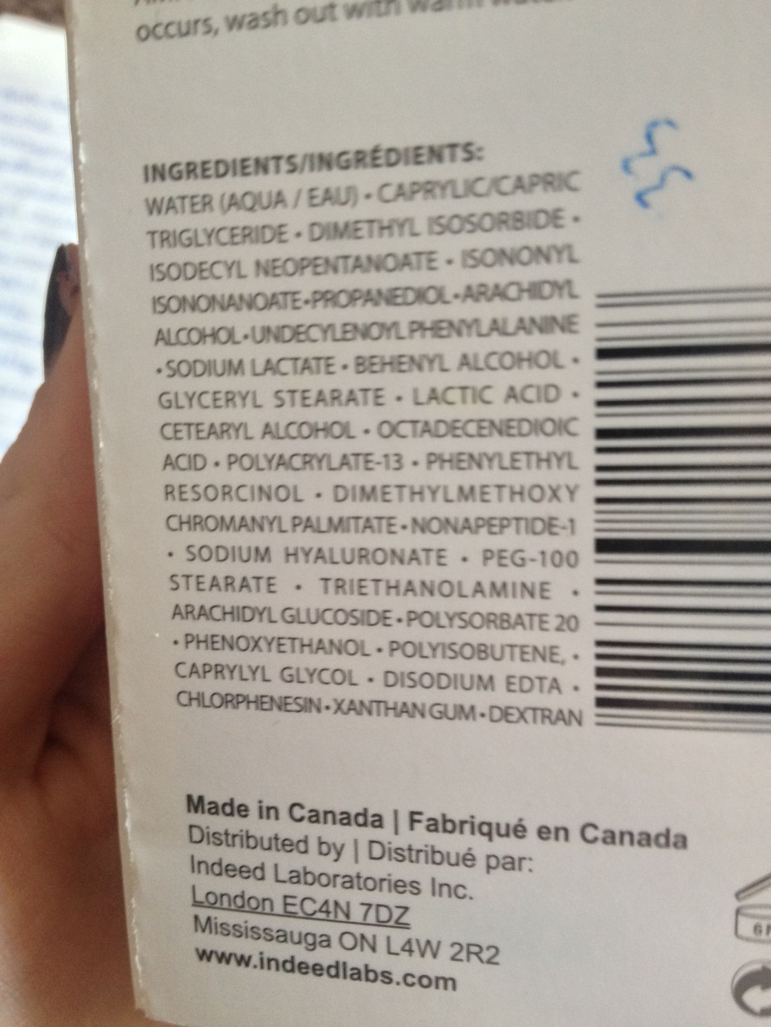
the ingredients
the ingredients

The official description of the cream-serum, taken directly from the box is as follows:

Our promise is to deliver the most advanced peptide based skin brightening treatment. Pepta-Bright is a  combination of 7 powerful active ingredients which target 7 biological factors. This cream-serum is designed to improve the appearance of hyperpigmentation, age spots and uneven skin tone. The unique formula is lightweight yet rich in texture. Pepta-bright helps to reduce the intensity of dark spots while promoting overall skin clarity and brightness, leaving a luminous and radiant complexion. You’ll be surprised by how fast you will see results!

From my previous research and trial and error along with checking the always-helpful cosdna, there does not seem to be any overly harsh or commonly irritating ingredients in this offering – but as always everyone has different skin but mine is incredibly sensitive especially to drying alcohols and I’m pleased to report there are none. This serum is essentially a chemical exfoliant with lactic acid as its active ingredient with a hydrating base containing glycerin. It’s as intense as promised but gentle at the same time (not an oxymoron, I promise)  in the sense that it’s free of harsh additives yet it’s a concentrated chemical exfoliant so you’re getting a whole lot of bang for your buck. It doesn’t irritate my easily irritated skin but it can tingle uncomfortably on skin that is already irritated.

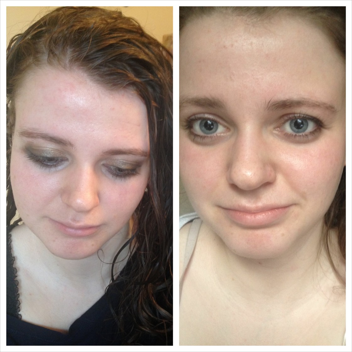
In my trial of chemical exfoliants in the last year, I’ve learned that results are not immediate but with continued use dramatic results do occur. I’m not going to hide my bias toward this product; with continuous use since the beginning of October, it’s become one of my very few hero skincare products. Now I can safely say that it’s provided dramatic results that I’m happy with but I didn’t really see results until two-three months of use regardless of how frequently I applied the product, yet the results were dramatic when I could see them.  It’s a testament to this products effecacy that since the results have become visible to me I’ve also received lots of compliments on my skin from friends that I see on a daily basis and this has been the only variable in my routine.

You can probably extrapolate my general skin condition and concerns from what I’ve said here but I thought further detail would be helpful; I have dry, dehydrated and easily irritated skin prone to redness, congestion, clogged pores, scarring and all sorts of lumps and bumps. In other words, my skin is naturally uneven and dull, lacking clarity and this has tremendously helped. The most dramatic difference has been in the decrease of those annoying clogged-pore bumps on my forehead, cheeks and chin but I’ve noticed fading of the scars that always accompany my breakouts as well as a more radiant and even complexions. As most products seem to be, Pepta-Bright is marketed with almost-otherworldly claims (“the most advanced”, anyone?)  but I think it actually does achieve on said claims. If you suffer from dullness, unevenness and the like, you need this treatment. It’s made its way into my nightime routine 3-4 times per week and I cry when I think about it leaving anytime soon. Take this from a skeptic and cynic like myself, this falls into the magical baby unicorn tears category.

left: without face makeup when I started using right: makeupless after five months of use
left: without face makeup when I started using
right: makeupless after five months of use

Have you tried this or anything similar? I’m always open to recommendations!

x, Maggie

Base Bonanza: Rimmel Wake Me Up Foundation

IMG_4807_fotor

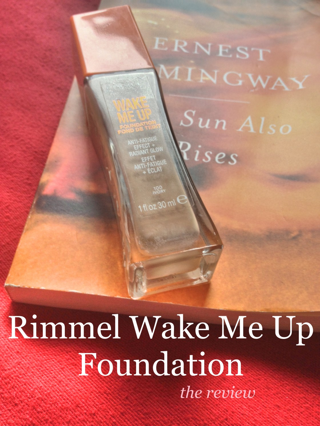
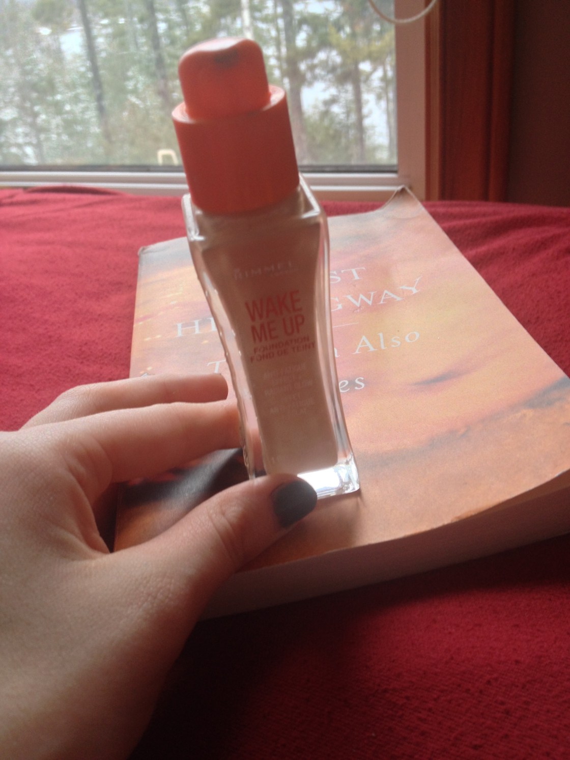
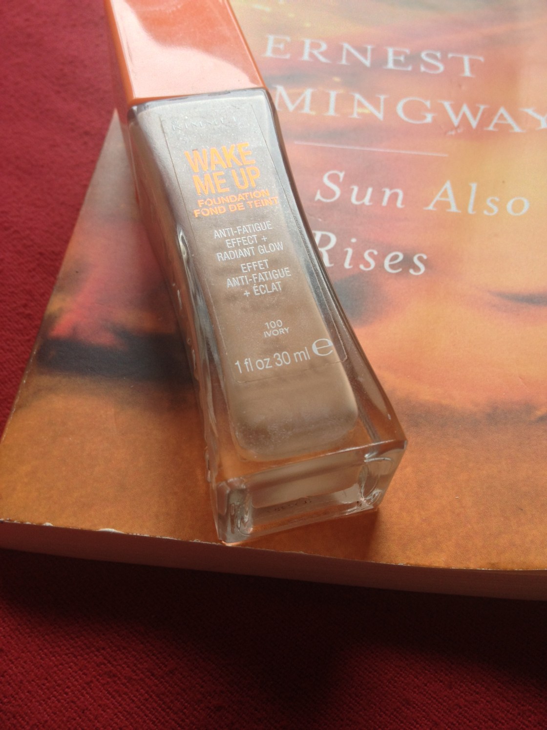
I have managed to talk about this foundation very frequently here without giving an actual review. Whoops. This was the first Drugstore foundation that I tried and was wowed by the great quality of – it’s better than many higher end ones I’ve tried. In short, in my view Rimmel Wake Me Up is a fantastic foundation, well for me at least.

IMG_4809

IMG_4815

IMG_4819

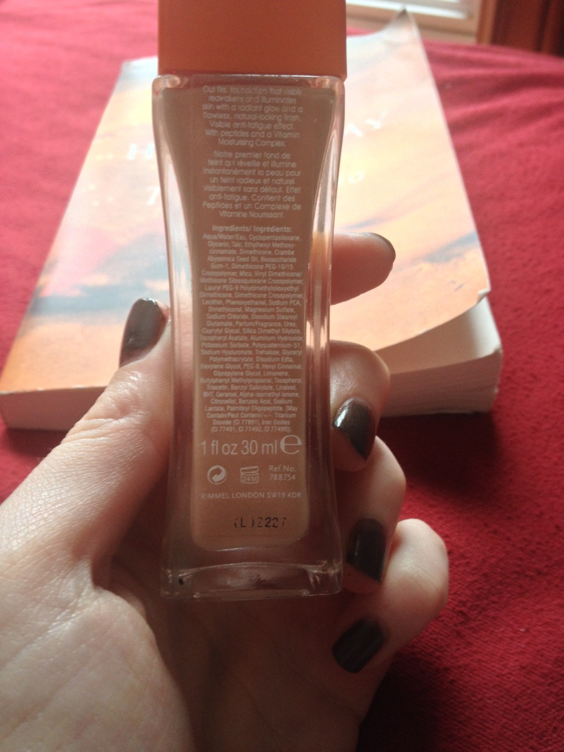
INGREDIENTS: AQUA/WATER/EAU, CYCLOPENTASILOXANE, TITANIUM DIOXIDE, GLYCERIN, TALC, ETHYLHEXYL METHOXYCINNAMATE, DIMETHICONE, CRAMBE ABYSSINICA SEED OIL, BIOSACCHARIDE GUM-1, DIMETHICONE PEG-10/15 CROSSPOLYMER, MICA, VINYL DIMETHICONE/ METHICONE SILSESQUIOXANE CROSSPOLYMER, LAURYL PEG-9 POLYDIMETHYLSILOXYETHYL DIMETHICONE, DIMETHICONE CROSSPOLYMER, LECITHIN, PHENOXYETHANOL, SODIUM PCA, DIMETHICONOL, MAGNESIUM SULFATE, SODIUM CHLORIDE, DISODIUM STEAROYL GLUTAMATE, PARFUM/FRAGRANCE, UREA, CAPRYLYL GLYCOL, SILICA DIMETHYL SILYLATE, TOCOPHERYL ACETATE, ALUMINUM HYDROXIDE, POTASSIUM SORBATE, POLYQUATERNIUM-51, SODIUM HYALURONATE, TREHALOSE, GLYCERYL POLYMETHACRYLATE, DISODIUM EDTA, HEXYLENE GLYCOL, PEG-8, HEXYL CINNAMAL, DIPROPYLENE GLYCOL, LIMONENE, BUTYLPHENYL METHYLPROPIONAL, TOCOPHEROL, TRIACETIN, BENZYL SALICYLATE, LINALOOL, BHT, GERANIOL, ALPHA-ISOMETHYL IONONE, CITRONELLOL, BENZOIC ACID, SODIUM LACTATE, PALMITOYL OLIGOPEPTIDE.

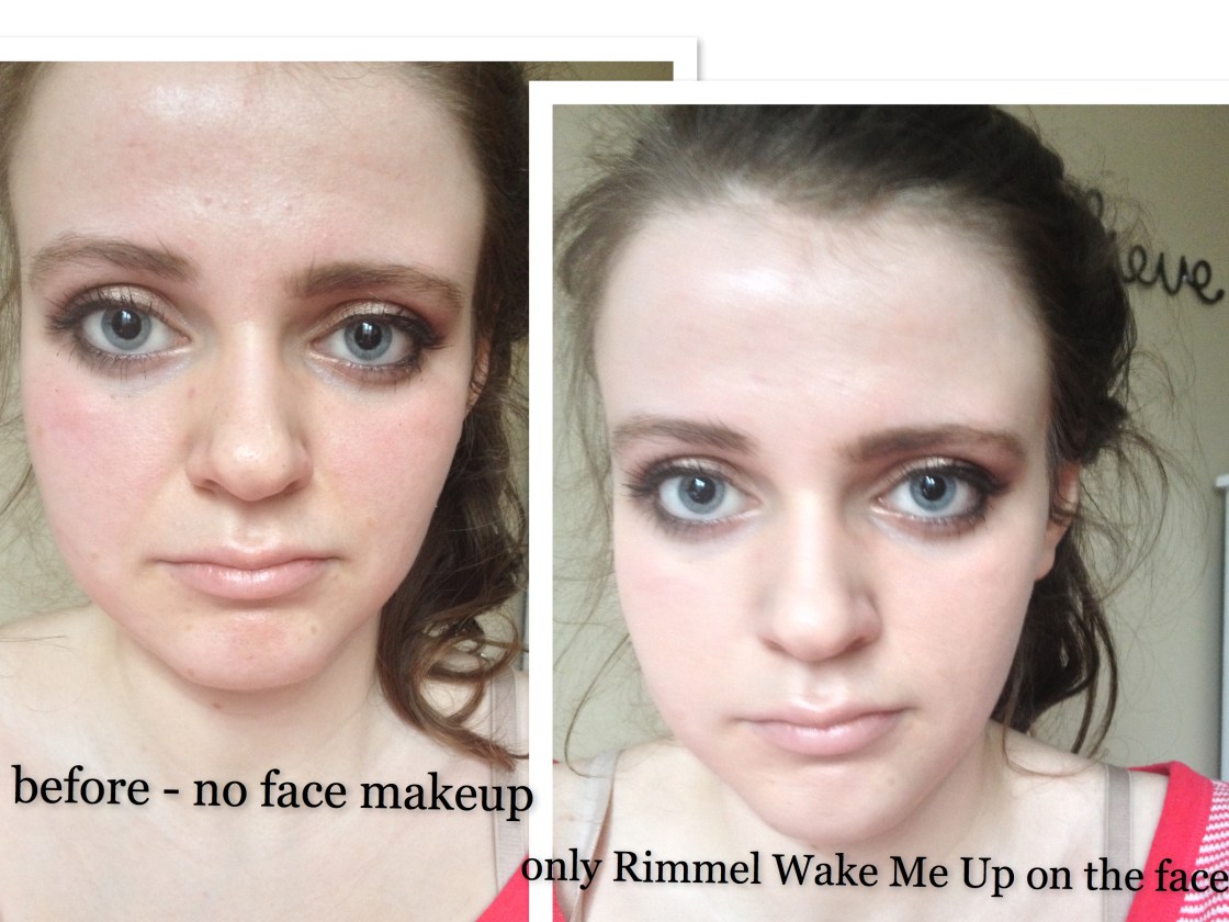
Well I couldn’t find this foundation on Rimmel’s Canadian site oddly enough so I had to make due with the UK one even though the UK formulation is slightly different, as in it contains SPF whereas the one I have does not. Basically it claims to be light and moisturizing on the skin, gives an instant flawless natural-looking finish and has a visible anti-fatigue effect with peptides and a “moisturizing vitamin complex”. To me this sounds like it was made to be in the vein of Bourjois 10 Hour Sleep Effect with the radiance claims and vitamin ridiculousness – Bourjois is known for its claims to do with vitamins and antioxidant which I am quite skepical of. Nevertheless, I find that these foundations differ. Wake Me Up isn’t quite as dewy in my opinion but has the radiance nevertheless with increased longevity and coverage. On the UK website Rimmel describes the product as “Rimmel’s first liquid foundation that instantly reawakens skin with a healthy, radiant glow” and the “light, moisturising texture applies smoothly and leaves skin feeling soft and comfortable all day” and “gives an instant flawless, natural-looking finish” with its “visible anti-fatigue effect with peptides and a Vitamin Moisturising complex”. Like with every other foundation on the market, it does not make the skin look instantly flawless and I’m skeptical of the ingredients doing anything magic, but I believe it achieves on the rest of its claims.

It’s a thicker yet somewhat weightless tacky (until it sets) liquid consistently. It’s even more viscous than MUFE HD. It provides medium coverage that is somewhat buildable on the skin. As promised, the formulation is light and hydrating and the ingredients are the ideal ones for my skins particular needs. It’s free of irritating alcohols, although it does include some fragrance and contains a high concentration of silicones, which I know break some people out but on my dehydrated skin, they help the foundation to sit more nicely over the skin. The good amount of glycerin in the foundation explains its hydrating properties. I really can’t see the shimmer in the foundation unless I squint really hard at the bottle under harsh lighting and I definitely cannot see the shimmer on my face in any sort of lighting. In other countries, the foundation seems to contain spf but in Canada it does not appear to – this is a godsend to me because my skin tends to be reactive to formulations including chemical SPF.
As a whole, the colour range of Rimmel’s offering leaves much to be desired even compared to other ranges at the drugstore but the lightest shade of the six, ivory, a moderately fair shade with yellow undertones suits my skin perfectly which is a rarity for me. The shades really only cater to those with moderately fair skin to those with medium skin tones.
Keep in mind here that I do have perpetually dehydrated skin, but I do not think that this foundation can be described as truly dewy, as say Bourjois 10 Hour Sleep Effect but it does provide a bit of radiance and glow to the skin. It’s slightly glowier than a satin finish and the shimmer particles that I can’t detect seem to highlight the naturally high points of my face and powdered (although I rarely wear it this way) it looks like a natural finish. However, I know the finish of a foundation varies across different skin types and it generally applies glowier on an oilier skin. I would describe it as luminous-looking on the skin.
rimmel
Because this foundation is not truly super-dewy and has surprising lasting power on the skin – I find that on it’s own it lasts 12+ hours everywhere except on inflamed blemishes -, it’s suitable for a variety of skin types. Those with  slightly dry skin, normal skin and combination skin would suit this foundation the best if they are looking for some natural-looking luminosity with longevity and coverage. It does not cling to dry patches but does not effortlessly and invisibly glide over major ones either.
I’m tempted to say this is my favourite foundation. For my dry skin, it’s a failsafe option regardless of the state of my skin is, for instance whether I’m suffering through blemishes and abundant dry patches or if it’s acting its slightly dehydrated self. I don’t think a single week has gone by where I haven’t worn this foundation when I got it in the spring and there are months when I pretty much wore this exclusively.
The packaging is quite nice-looking especially for the price point, albeit quite large and impractical for travel. It comes in an asymetrical glass bottle with a large orange cap and has a matching orange pump. I’m happy to say this affordable foundation actually has a pump!
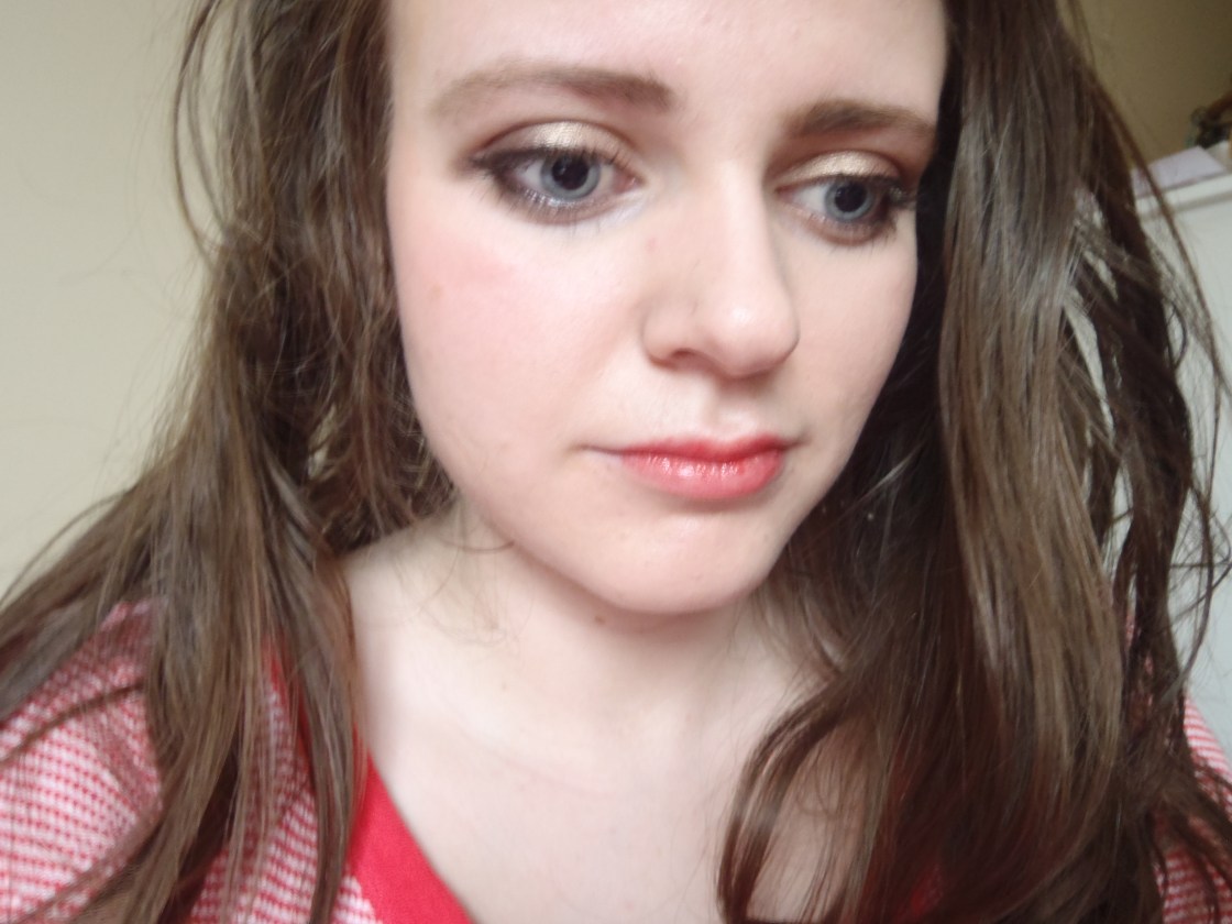
worn with full-faced makeup
both taken with flash: right after application on the left and twelve hours after on the right
The Claims: 9/10
Formulation: 9.5/10
Longevity: 9.5/10
Packaging: 9.5/10
Overall Quality: 9.5/10
Total: 46.5/50 or 93%, A+

x,

Maggie.

If you’ve tried this foundation, tell me your thoughts below! I’m also always open to recommendations 🙂

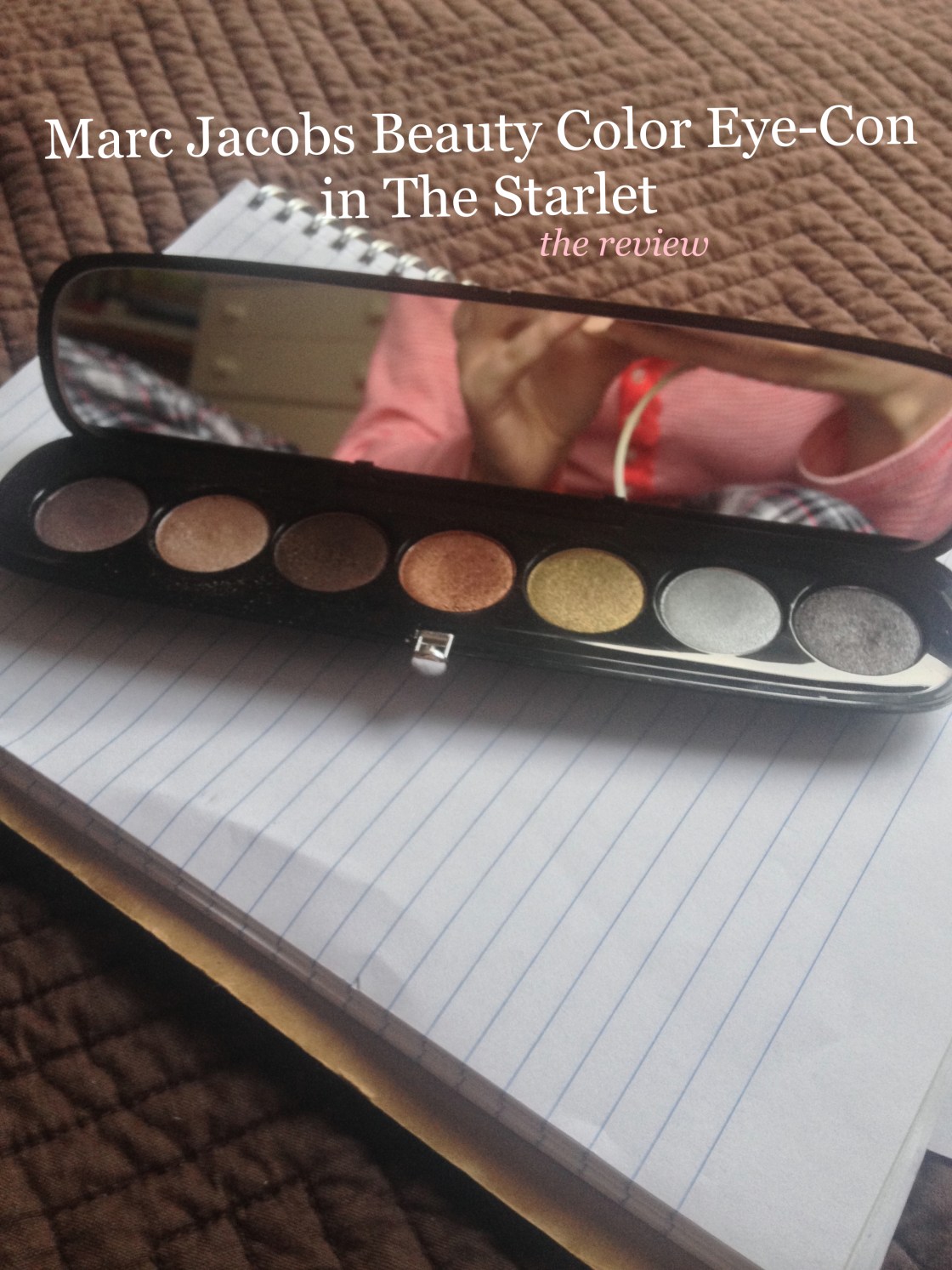
Marc Jacobs Beauty Color Eye-Con Palette in 204 The Starlet

IMG_4710_fotor

IMG_4712

IMG_4714

IMG_4720

IMG_4721

After hearing the trusted Christine from Temptalia’s shining review of Marc Jacobs Color Eye-Con Palette in 204 The Starlet (and I recommend reading her review for superior shade descriptions and comparisons to other shades and more of a succint review), I had to see the beauty in person and upon seeing it, I decided that I had to have it and luckily my mother listened to my ravings and she gave it to me for Christmas despite her reservations about giving her clearly makeup-obsessive daughter yet another neutral palette – we do not share the same love of makeup, sigh. I’ve used this a great deal since finding it underneath the tree and I feel compelled to talk about the metallic oft-neglected palette.

I seem to have this tendency to forget to talk about the basics so I’ll begin with such details. The sleek black rounded and compact contains five shades with 0.24 oz (0.035 oz each so slightly smaller than the average full-sized shades) of product and luxurious packaging featuring a moderately sized mirror and a secure clasp closure. At Sephora, the palette retails for $59 US/$71 CDN. In line with the description of the palette, all shades are metallic but I must say they are refined shimmery shadows, more in line with Dior’s shimmery shades than Urban Decay’s and I don’t have a particular problem with the lack of matte shades but this won’t necessarily be an all-in-all palette. However, I wear this alone but also like to use alongside my staple matte shadows.

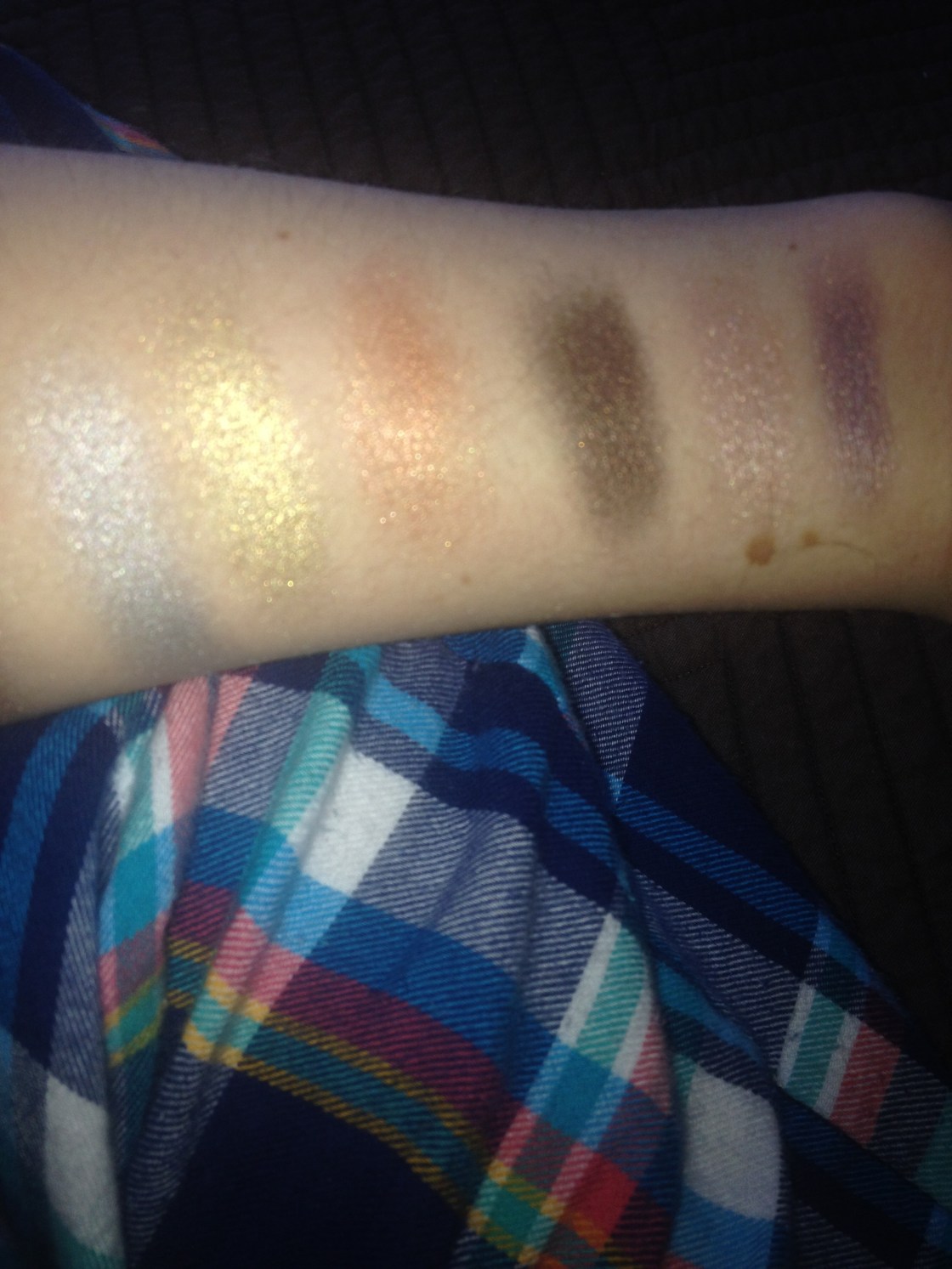
The shadows are among the best that I’ve ever tried – very longlasting, pigmented, iridescent, smooth, buttery and blendable – and they are technically neutral shades but they are very interesting for neutral shades and differ from the average neutral palette. Overall, the palette seems to be warm-toned (although there are one or two cool shades) and if you’re a fan of the Naked 1, I see you really being wowed by this offering. For some semblance of clarity, I’ll talk about the shades from left to right in the palette.

the shades minus the grey

IMG_4247

IMG_4246

the grey in all of it's glory
the grey in all of it’s glory

Shade One is a medium-toned purply taupe that reminds me of MAC Satin Taupe with more purple and lighter in colour and is similar but more purple-toned than the second shade in NARS Kalahari. 

Shade Two is a peachy-pink champagne shade that has warm undertones, lighter than MAC All That Glitters but darker than Urban Decay Sin.

Shade Three is a warm bronzy darkened chocolate brown that is similar to Urban Decay Darkhorse but is less green-based and more bronze.

Shade Four is a light-medium true copper shade that I don’t own any shades that are similar to but I would describe this shade as being halfway between the uber-dramatic MAC Coppering and the more subdued MAC Woodwinked. It’s a wearable copper.

Shade Five is a relatively light silver with a noticable blue lean to it. It reminds me of the “eyelid” shade on the left hand side of Wet n Wild’s Blue Had Me At Hello.

Shade Six is a medium-toned antiqued gold that I don’t own anything similar to and is much less warm-toned than say Urban Decay Half-Baked. 

Shade Seven is deceptive in the pan, as the shade pulls much more neutral and taupe in tone when applied onto the lids; it’s a medium-dark taupe-grey shade that to me looks like a darkened and greyed version of MAC Satin Taupe and reminds me of Urban Decay Mushroom.

The shades are all consistent in quality and this is one of those palettes that I wear all the shades on a regular basis – the metallic palette is surprisingly versatile in my experience. The champagne is one of those lid shades that I adore and the copper is subtle enough to be worn with more dramatic lips while still looking striking. The purply taupe is lovely in the crease.  The gold is a stunning one and it seems wearable because it’s an antiqued tone. The silver is beautiful for a smoky eye – I wore it on New Years! – but can be difficult to wear on the regular because of its blue lean. The grey-taupe seems to be the perfect shade to smoke out the eye without creating much mess or fallout and the dark bronze is dark enough to use to define the outer corner and lashes. I think the palette was rather well thought out but I would only recommend if you’re a fan of shimmery shadows. This is a palette that I find myself reaching for both when I want to wear a bolder lip and need to tone it down on the eyes and when I want to go for some smoulder.

the champagne on the inner lid, copper on the outer lid and grey in the outer corner
the champagne on the inner lid, copper on the outer lid and grey in the outer corner – ignore the fact that it looks like my foundation doesn’t match… winter lighting is ridiculous
ditto
ditto
the champagne on the lid, the taupe in the crease and the bronze in the outer corner
the gold on the lid and the grey in the outer-corner and crease with a little bit of MAC Charcoal Brown in the crease to blend

The Rating Breakdown

Pigmentation – 10/10

Longevity – 9.5/10

Packaging – 10/10

Value – 9.5/10

Overall Quality – 10/10

Total Grade – 49/50= 98%/ A+

x,

Maggie.

Have you tried any products from Marc Jacobs Beauty? What do you think?

Unheard and Under-Appreciated #1: Dior Earth Reflection Quint

IMG_2283_fotor
the lightest of swatches
Glorious, aren't they?
Glorious, aren’t they?

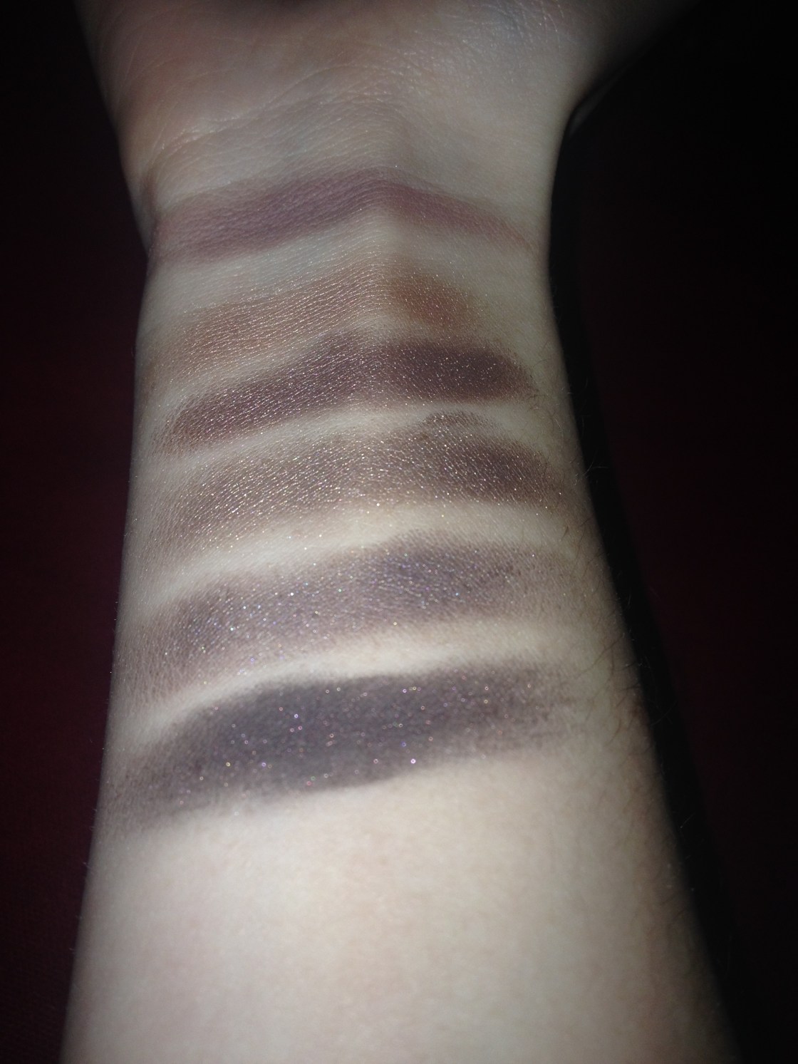
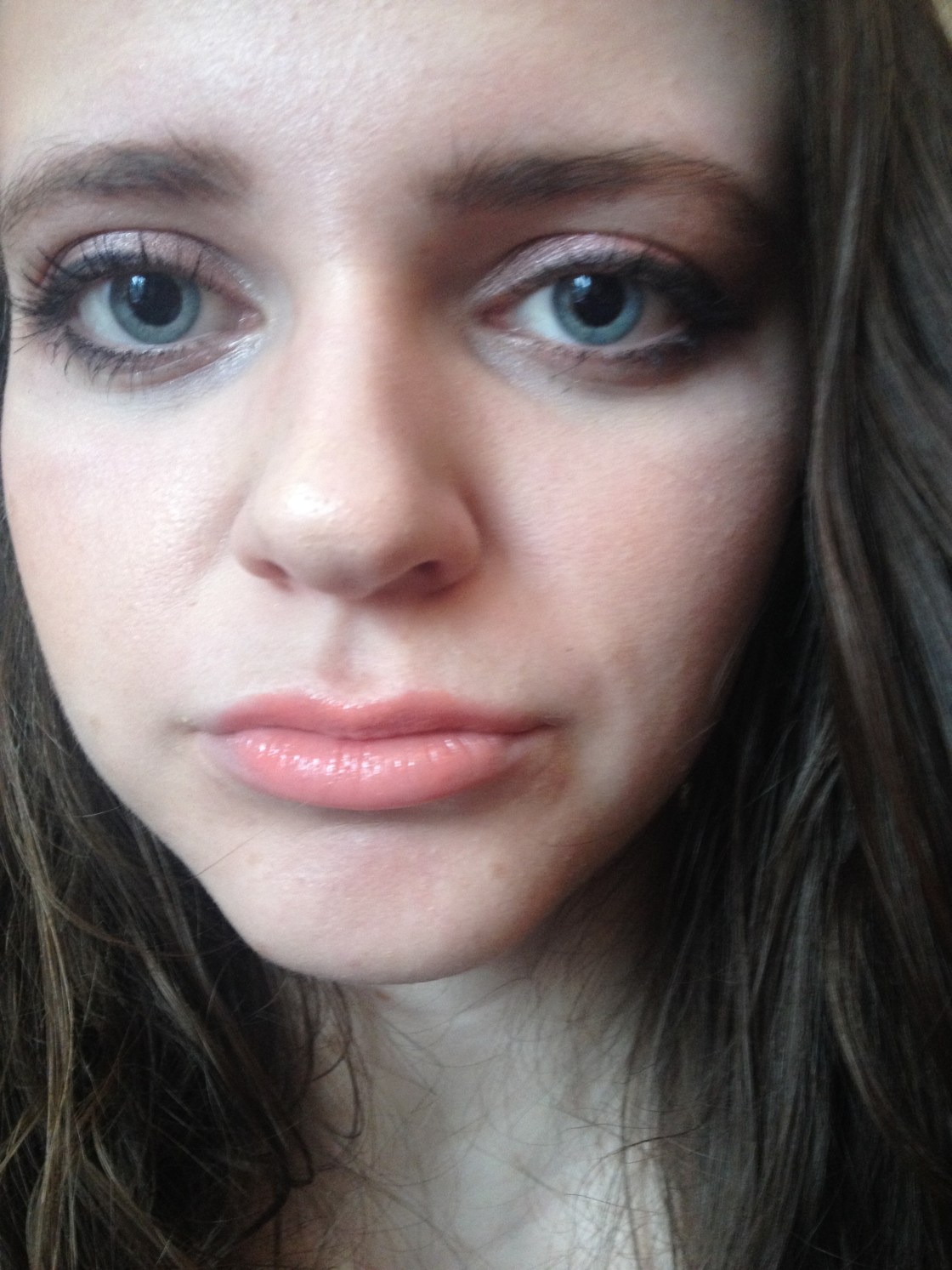
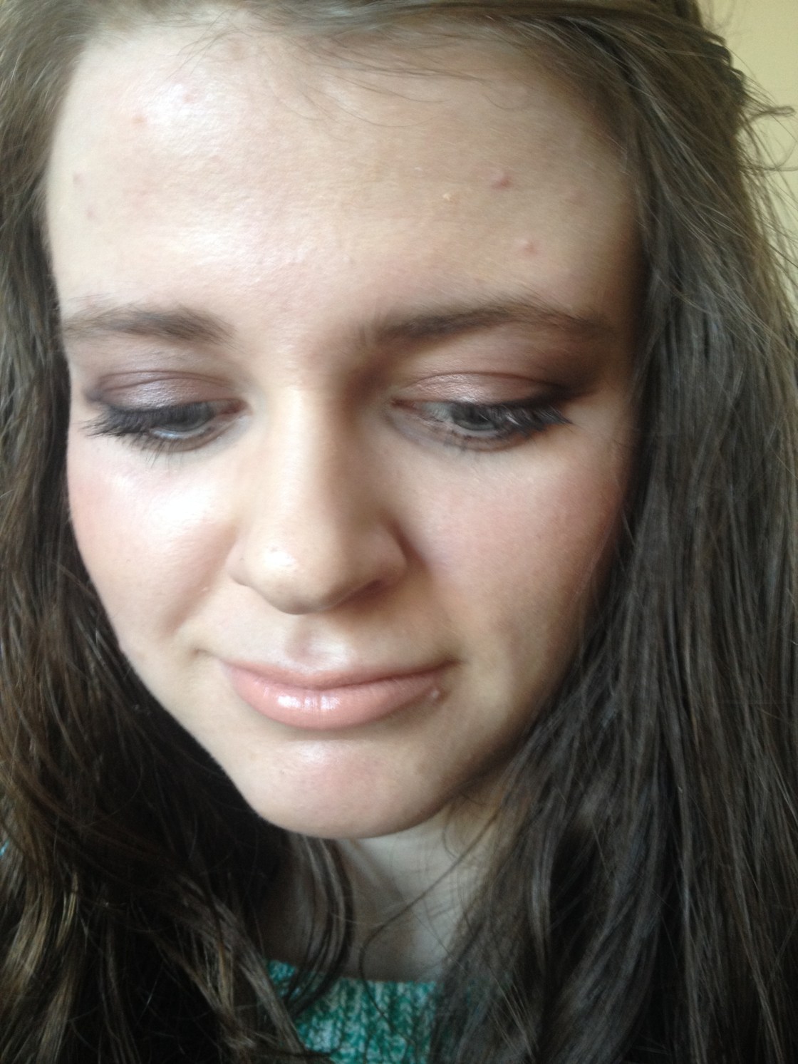
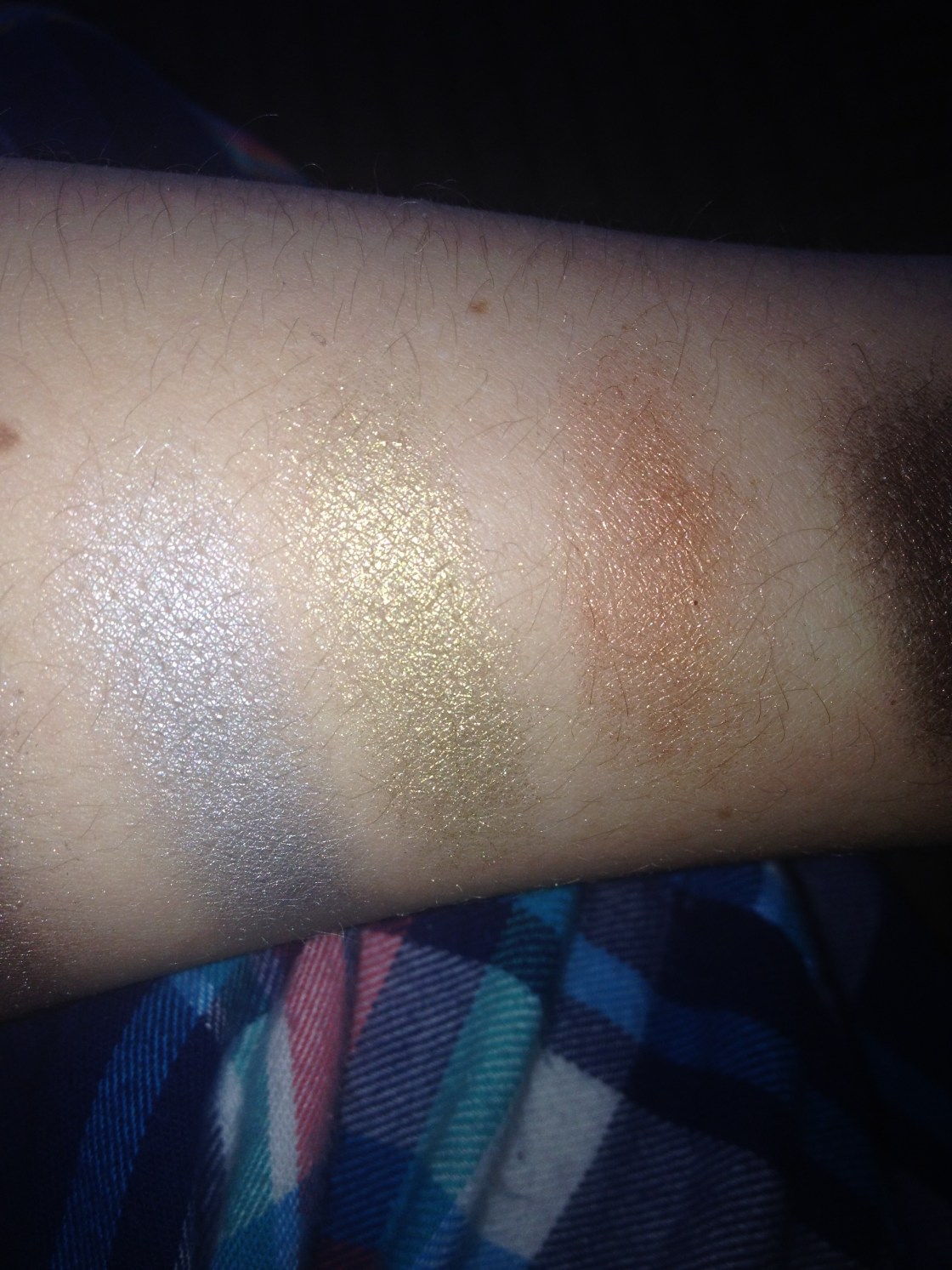
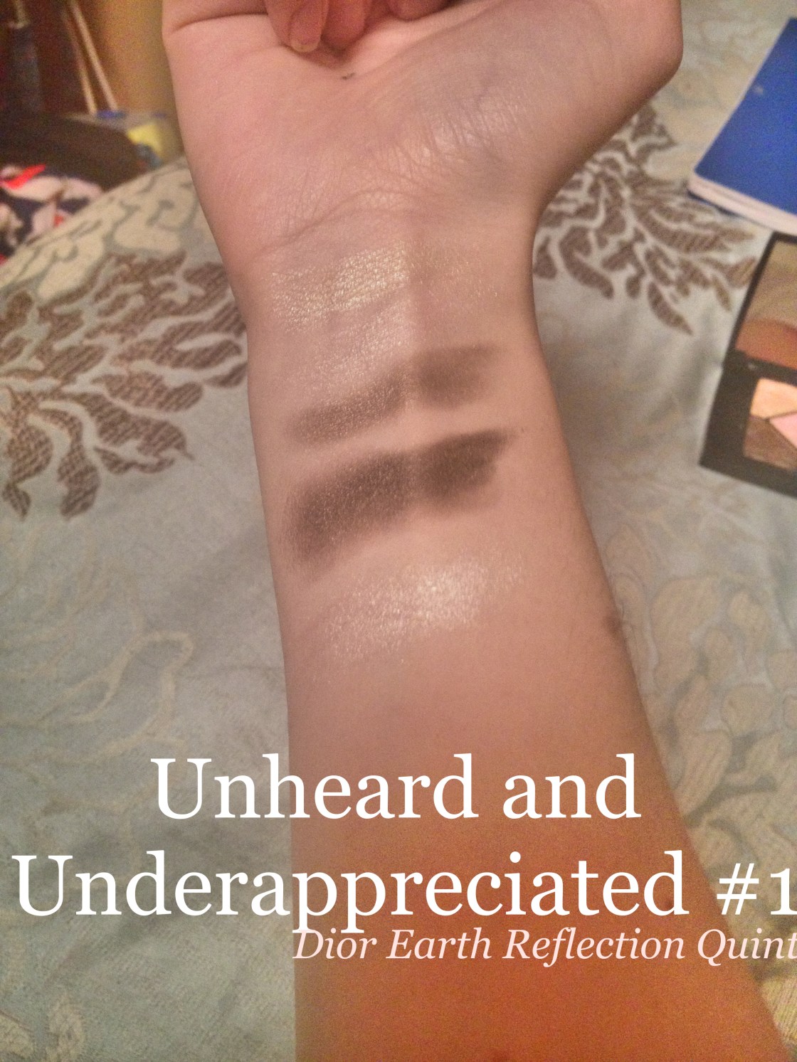
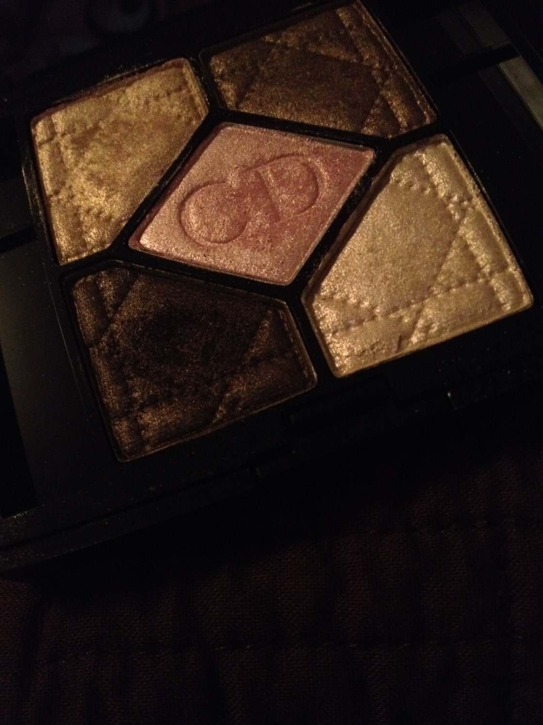
So Dior 5 Colour Eyeshadow in 609 Earth Reflection isn’t completely unheard of as I wrote a shining review of it after I picked it up in the Fall and I went on about it in one of my monthly favourites posts but the quint definitely deserves to be talked about. I’m tempted to describe the shadows as the makeup equivalent of baby unicorns, as completely insane as that sounds; the completely iridescent quint of eyeshadows that aren’t over the top in the slightest have great pigmentation and have the most blendable buttery texture that do warrant the $61 CDN price tag.

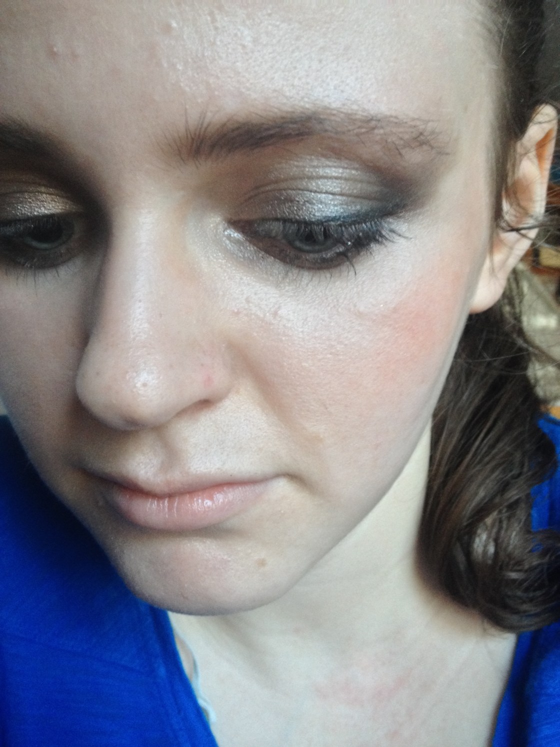
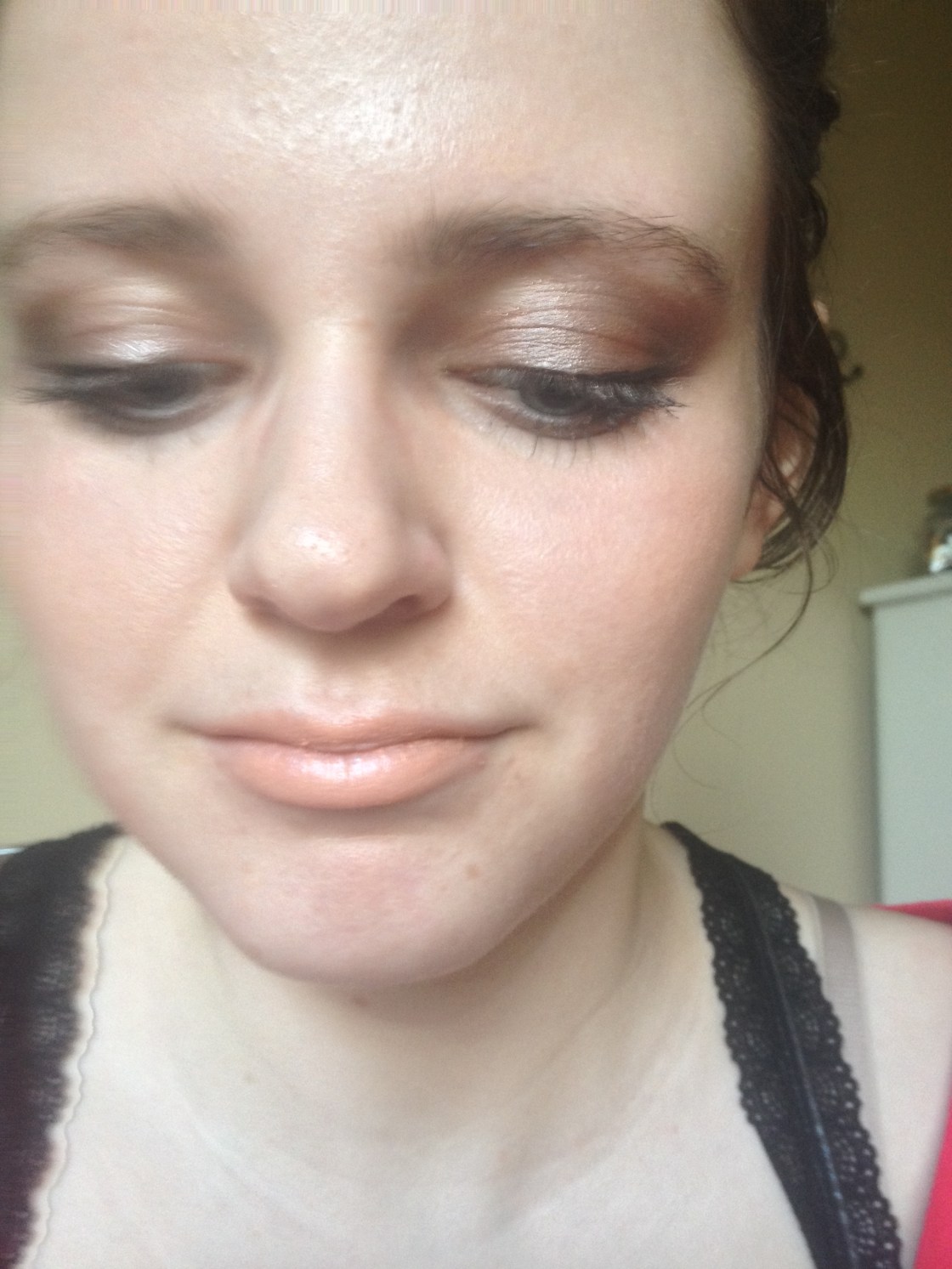
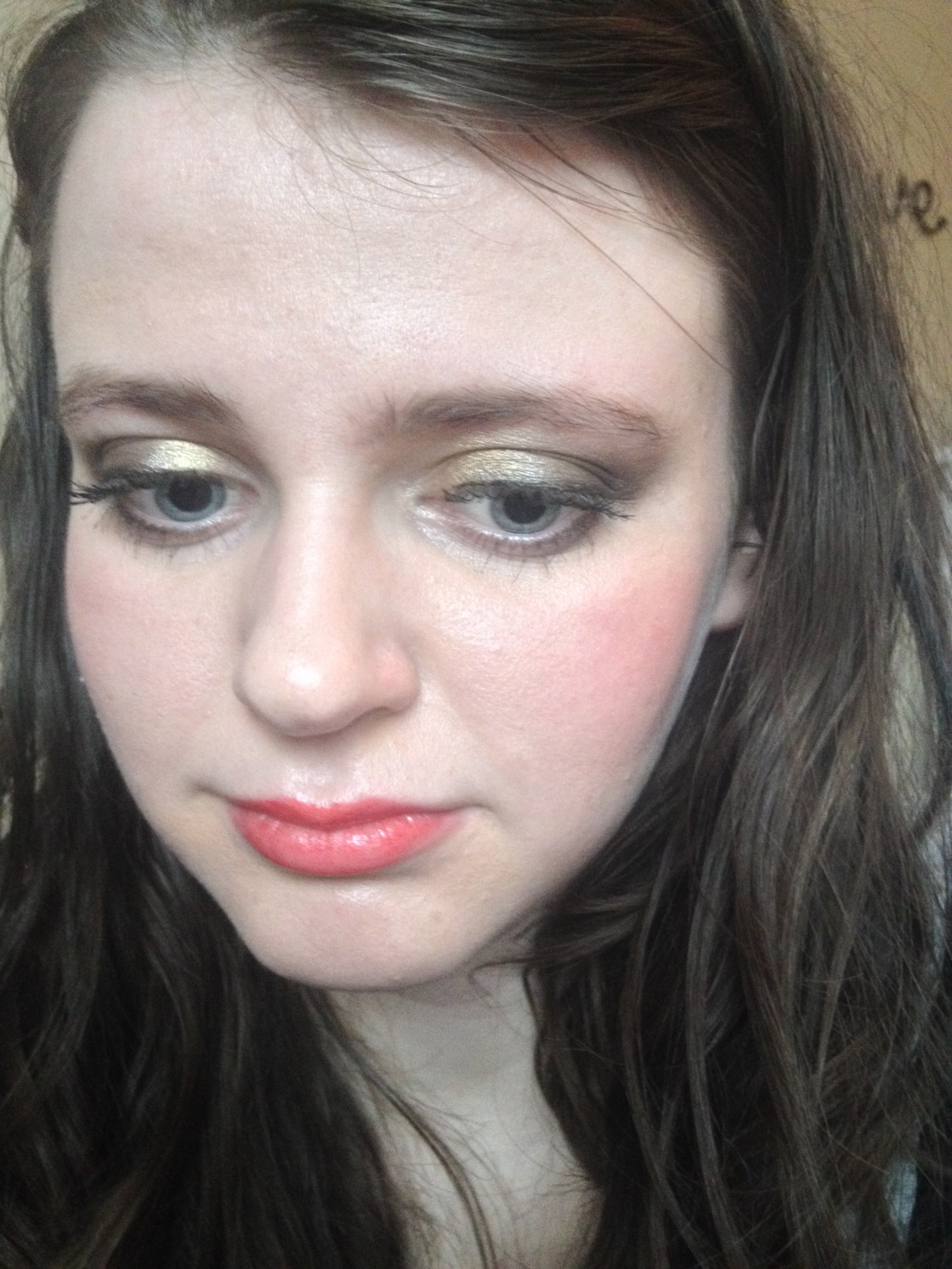
The palette makes the daily eye just so easy. Without really noticing it, I kept reaching for this palette on the regular for multiple consecutive days and I’m not the kind of girl who wears the same makeup two days in a row – I’m bored easily, I’m afraid. Without being overly shimmery, the shades have that brightening and illuminating effect particularly on the inner corner and they are a godsend applied haphazardly on lazy mornings after sleepless nights. The five shades are perfect – enough shades for an eyeshadow addict like I am without having too much choice that can cultivate stress that I certainly don’t need. The two lightest shades are the best highlights but look nice on the lids when you want to look bright-eyed. The pale gold goes on the lid, a bit of the taupe goes on the outer portion of the lid and blended up into the crease, darkest shade is added into the outer corner for definition and a paler shade is added into the inner corner – viola, you’re done and ready to go… well after liner and mascara.

Although, I’d classify this offering from Dior as seasonless, there’s something about it that screams winter. The neutral taupe shades create that bright eye that reminds me of snow and feels right for the winter. If you’re looking for another strange comparison, these shades are like a coffee for your face as they are instantly energizing. Can you tell I enjoy this quint?

x,

Maggie

The everyday eye courtesy of Dior Earth Reflection
a closer look
a closer look


What’s your favourite under-appreciated product?